
Cards contain content and actions that relate to information about a subject. Card is the equivalent of a CardView in Compose
How to use Card in android jetpack compose.
What's new
Color: New color mappings and compatibility with dynamic color,
Elevation: Lower elevation and no shadow by default,
Types: Three official card types – elevated, filled, and outlined
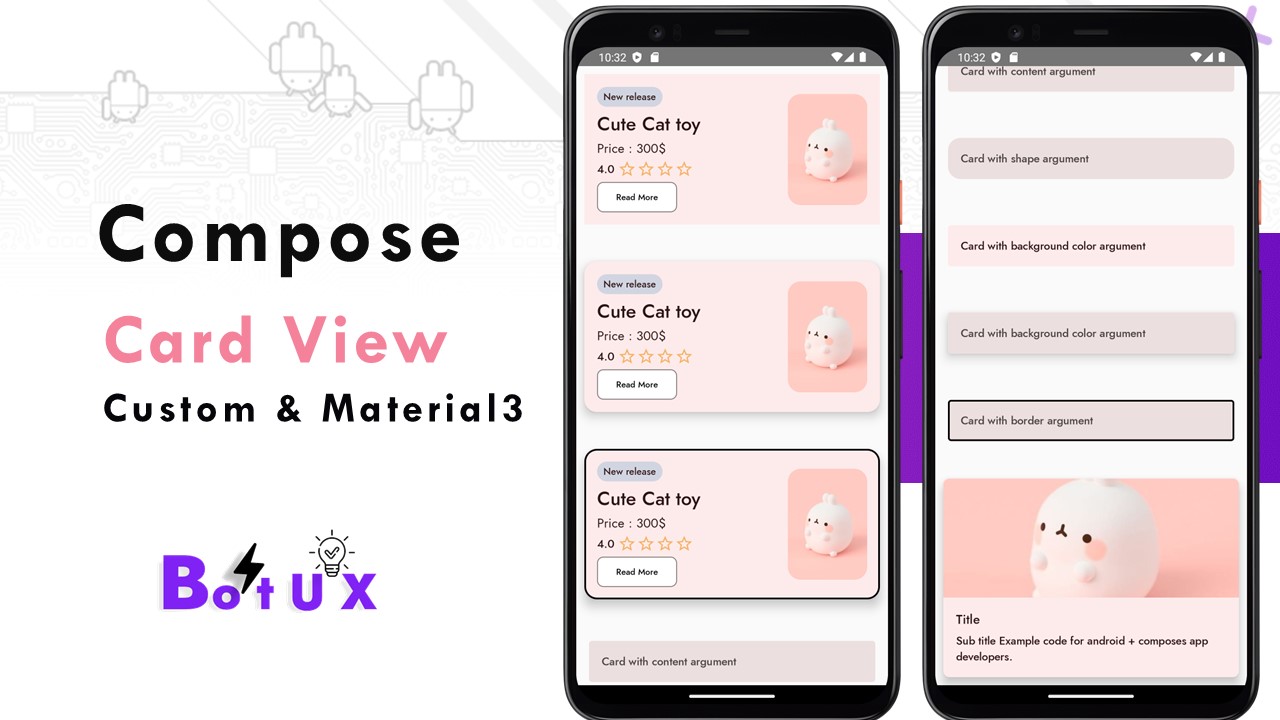
- Card with a content argument
- Card with shape argument
- Card with background color argument
- Card with elevation argument
- Card with border argument
- Card example (material 3)
- Simple Custom Card view
- Simple Custom Card view with elevation & shapes
- Simple Custom Card view with black border stock
Card with a content argument
  // using card material3 design
                    // * Card with content argument
                    Card(
                        modifier = Modifier
                            .fillMaxWidth()
                            .padding(16.dp),
                        content = {
                            Text("Card with content argument",
                                modifier = Modifier.padding(16.dp),
                                style = MaterialTheme.typography.labelLarge)
                        }
                    )
..
Card with shape argument
 // * Card with shape argument
                    Card(
                        modifier = Modifier
                            .fillMaxWidth()
                            .padding(16.dp),
                        //set shape of the card
                        shape = RoundedCornerShape(16.dp),
                        content = {
                            Text("Card with shape argument", modifier = Modifier.padding(16.dp),style = MaterialTheme.typography.labelLarge)
                        }
                    )
..
Card with background color argument
// * Card with background color argument
                    Card(
                        modifier = Modifier
                            .fillMaxWidth()
                            .padding(16.dp),
                        //set background color of the card
                        colors = CardDefaults.cardColors(
                            containerColor =  MaterialTheme.colorScheme.primaryContainer,
                        ),
                        content = {
                            Text("Card with background color argument", modifier = Modifier.padding(16.dp),style = MaterialTheme.typography.labelLarge)
                        }
                    )
..
Card with elevation argument
 // * Card with elevation
                    Card(
                        modifier = Modifier
                            .fillMaxWidth()
                            .padding(16.dp),
                        //set card elevation of the card
                        elevation = CardDefaults.cardElevation(
                            defaultElevation =  10.dp,
                        ),
                        content = {
                            Text("Card with background color argument", modifier = Modifier.padding(16.dp),style = MaterialTheme.typography.labelLarge)
                        }
                    )
..
Card with border argument
 // * Card with border argument
                    Card(
                        modifier = Modifier
                            .fillMaxWidth()
                            .padding(16.dp),
                        border = BorderStroke(2.dp, androidx.compose.ui.graphics.Color.Black),
                        content = {
                            Text("Card with border argument", modifier = Modifier.padding(16.dp),style = MaterialTheme.typography.labelLarge)
                        }
                    )
..
Card example (material 3)
 Card(
                        //shape = MaterialTheme.shapes.medium,
                        shape = RoundedCornerShape(8.dp),
                        // modifier = modifier.size(280.dp, 240.dp)
                        modifier = Modifier.padding(10.dp,5.dp,10.dp,10.dp),
                        //set card elevation of the card
                        elevation = CardDefaults.cardElevation(
                            defaultElevation =  10.dp,
                        ),
                        colors = CardDefaults.cardColors(
                            containerColor =  MaterialTheme.colorScheme.primaryContainer,
                        ),
                    ) {
                        Column(modifier = Modifier.clickable(onClick = {  })) {

                            Image(
                                painter = painterResource(R.drawable.img_plant_11),
                                contentDescription = null, // decorative
                                contentScale = ContentScale.Crop,
                                modifier = Modifier
                                    .height(150.dp)
                                    .fillMaxWidth()
                            )

                            Column(modifier = Modifier.padding(16.dp)) {
                                Text(
                                    text = "Title",
                                    style = MaterialTheme.typography.titleMedium,
                                    maxLines = 2,
                                    overflow = TextOverflow.Ellipsis
                                )

                                Spacer(modifier = Modifier.height(5.dp))

                                Text(
                                    text = "Sub title Example code for android + composes app developers.",
                                    //maxLines = 1,
                                    //overflow = TextOverflow.Ellipsis,
                                    style = MaterialTheme.typography.titleSmall,
                                )
                            }
                        }
                    }
..
Simple Custom Card view with elevation & shapes
@Preview
@Composable
fun CardElevation() {
    Surface(
        shape = RoundedCornerShape(16.dp),
        color = Color(0xFFDAE1E7),
        modifier = Modifier
            .height(210.dp)
            .padding(10.dp),
        shadowElevation = 10.dp
    ) {
        Row(
            modifier = Modifier.padding(16.dp),
            verticalAlignment = Alignment.CenterVertically
        ) {
            Column(
                modifier = Modifier
                    .fillMaxSize()
                    .weight(2f),
                verticalArrangement = Arrangement.Center
            ) {
                Surface(
                    shape = RoundedCornerShape(24.dp),
                    modifier = Modifier.wrapContentSize(),
                    color = Color(0xFFD1D5E1)
                ) {
                    Text(
                        text = "New release",
                        fontSize =  12.sp,
                        style = MaterialTheme.typography.titleLarge,
                        modifier = Modifier.padding(vertical = 4.dp, horizontal = 8.dp)
                    )
                }

                Spacer(modifier = Modifier.height(4.dp))

                Text(
                    text = "Gift Plant",
                    fontSize =  24.sp,
                    style = MaterialTheme.typography.titleLarge,
                    fontWeight = FontWeight.SemiBold
                )

                Spacer(modifier = Modifier.height(2.dp))

                Text(text = "Price : 300$")

                Spacer(modifier = Modifier.height(2.dp))

                Row(verticalAlignment = Alignment.CenterVertically) {
                    Text(
                        text = "4.0",
                        fontSize =  14.sp,
                        fontWeight = FontWeight.SemiBold,
                        style = MaterialTheme.typography.titleLarge
                    )
                    Spacer(modifier = Modifier.width(4.dp))
                    Icon(
                        painter = painterResource(id = R.drawable.baseline_star_outline_24),
                        tint = Color(0xFFF6B266),
                        contentDescription = null
                    )

                    Icon(
                        painter = painterResource(id = R.drawable.baseline_star_outline_24),
                        tint = Color(0xFFF6B266),
                        contentDescription = null
                    )

                    Icon(
                        painter = painterResource(id = R.drawable.baseline_star_outline_24),
                        tint = Color(0xFFF6B266),
                        contentDescription = null
                    )
                    Icon(
                        painter = painterResource(id = R.drawable.baseline_star_outline_24),
                        tint = Color(0xFFF6B266),
                        contentDescription = null
                    )
                }

                Spacer(modifier = Modifier.height(4.dp))

                OutlinedButton(
                    shape = RoundedCornerShape(8.dp),
                    colors = ButtonDefaults.buttonColors(
                        contentColor = Color.Black,
                        containerColor = Color.White
                    ),
                    onClick = { /*TODO*/ }
                ) {
                    Text(
                        text = "Read More",
                        fontSize =  11.sp,
                        fontWeight = FontWeight.SemiBold,
                        style = MaterialTheme.typography.titleLarge
                    )
                }
            }

            Surface(
                shape = RoundedCornerShape(16.dp),
                modifier = Modifier.size(width = 100.dp, height = 140.dp)
            ) {
                Image(
                    painter = painterResource(id = R.drawable.img_plant_11),
                    contentScale = ContentScale.Crop,
                    contentDescription = null
                )
            }
        }
    }
}
..
Get full source code on Github:

Tags:
Jetpack Compose
