Google : Owl UI UX
Owl is an educational app that uses Material Design components and Material Theming to create an energetic, motivational brand experience.

About Owl:
Owl is an educational app that provides courses for people who want to explore and learn new skills in design, art, architecture, and fashion. The Owl brand uses bold color, shape, and typography to express its brand attributes: energy, daring, and fun.
Get Complete Source code:

Bold aesthetic
Owl’s design reflects the energy and excitement of learning a new skill, using a bold aesthetic that expresses exploration and growth. Its UI contains unfilled shapes that invite the user to populate them with new content and courses. Its copywriting speaks with an inviting, can-do tone of voice.
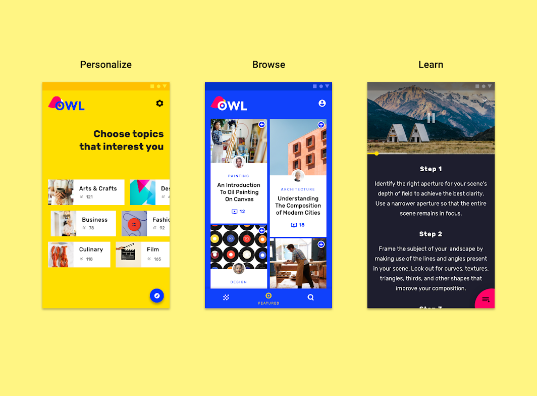
Product architecture

Owl is divided into three sections, each with its own color theme and interaction model:
Personalize (yellow)
Browse (blue)
Learn (magenta)
Hub and spoke structure
The information architecture of the app uses a hub and spoke structure.
The Browse section serves as a “hub,” where various “spokes,” or child nodes, are available to users in the form of instructional classes. After a class is chosen and the user enters the Learn section, the class becomes a hub, with each section of the class becoming a spoke.
This structure applies to the Browse and Learn sections of the app, while the Personalize section is an onboarding section.
Section 1: Personalize
The Personalize section is dedicated to selecting areas of interest. It’s characterized by a yellow theme. This section is a form of onboarding, where customized...
The Personalize section is dedicated to selecting areas of interest. It’s characterized by a yellow theme. This section is a form of onboarding, where customized chips represent selectable course subjects.
Navigation
Navigation can be accessed by tapping the blue floating action button in the lower right corner. Settings can be accessed through the settings icon.
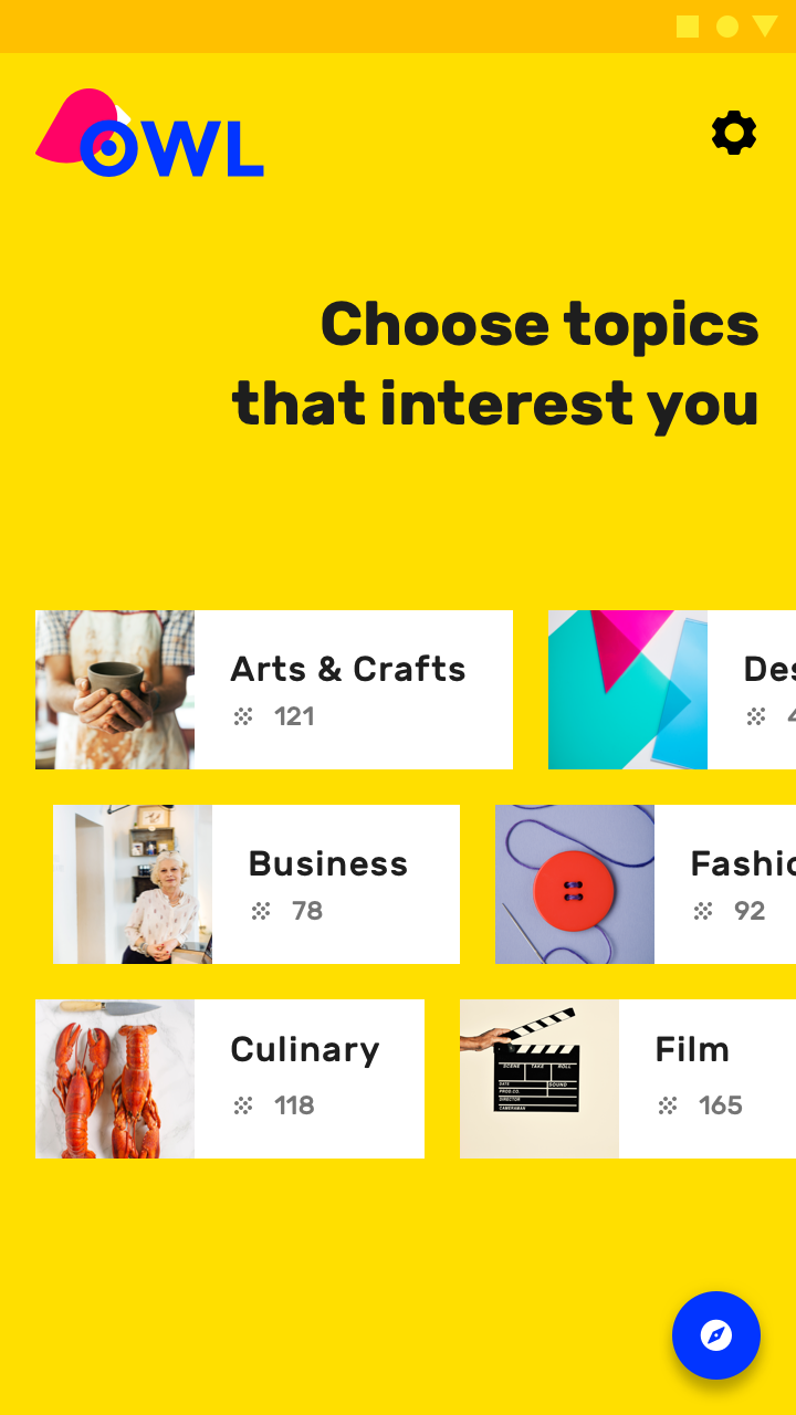
The Personalize section of Owl on mobile
Section 2: Browse
The Browse section is a hub for the user’s areas of interest. It’s characterized by a blue theme. This section contains three top-level navigation destinations:...
The Browse section is a hub for the user’s areas of interest. It’s characterized by a blue theme.
Navigation
This section contains three top-level navigation destinations:
- My Courses
- Featured
- Search
On mobile, Owl uses a bottom navigation bar to access these sections.


On mobile, use the bottom navigation to visit the Featured page.

On tablet and desktop, rail navigation provides access to the three destinations.

Section 3: Learn
This section is a hub for course content. Each course has an overview screen that contains tutorial videos. To access the tutorial videos for a...
This section is a hub for course content. Each course has an overview screen that contains tutorial videos.
Navigation
To access the tutorial videos for a course, tap the curved shape in the bottom right of the screen. To navigate back to the Browse section, tap the back arrow (in the top left of the screen).


On desktop and tablets in landscape orientation, there is enough screen space to show both the course overview content and videos.

On smaller desktop views and tablets in portrait orientation, videos are hidden by default, but they can be revealed by accessing a side sheet.

Layout : Grid system
Owl uses a responsive grid system, which has flexible columns and padding that can resize depending on the screen width (such as mobile, tablet, or...
Owl uses a responsive grid system, which has flexible columns and padding that can resize depending on the screen width (such as mobile, tablet, or desktop).

Color
Owl has three primary colors. Each color is used to create a distinct visual theme for each section.

Theme 1
For the Personalize section, yellow is the primary color, and blue is the secondary color.

Theme 2
For the Browse section, blue is the primary color, and yellow is the secondary color.

Theme 3
For the Learn section, pink is the primary color.

Typography : Type scale
Owl’s type scale provides the typographic variety necessary for the app content. All items in the type scale use Rubik as the typeface, and make...
Owl’s type scale provides the typographic variety necessary for the app content. All items in the type scale use Rubik as the typeface, and make use of the variety of weights available by using Rubik Regular, Medium, and Bold.

Rubik
Owl uses the Rubik typeface. Rubik is sans serif, with slightly rounded corners, and has many font weights.

Iconography
Owl’s iconography reflects the curved shape and style of it’s brand typeface Rubik.
1. To create consistency, all of Owl’s icons share the same underlying grid structure
2. A collection of Owl’s icons.

Shape: Categories
Components are grouped into shape categories based on their size. Shape categories let you set multiple component values at once. Shape categories include:
1. Small components
2. Medium components
3. Large components

Comments
Post a Comment