
Lists are continuous, vertical indexes of text or images.
This demo lets you preview the list component, its variations, and configuration options.
Displays a different type of list.
Usage :
Lists are a continuous group of text or images. They are composed of items containing primary and supplemental actions, which are represented by icons and text.
Kotlin RecyclerView LayoutManager Types
We can manage/create RecyclerView behaviors using LayoutMangers. RecyclerView uses pre-built LayoutMangers and Implements different behaviors such as :
- Vertical/Horizontal List(Using LinearLayoutManger),
- Uniform Grid List (Using GridLayoutManager),
- Staggered Grid List (Using StaggeredGridLayoutManager)
Linear Layout Manager
In order to show the list in a vertical or horizontal fashion, we make use of Horizontal LinearLayoutManager
layoutManager = LinearLayoutManager(context, LinearLayoutManager.HORIZONTAL, false)Vertical LinearLayoutManager
layoutManager = LinearLayoutManager(context, LinearLayoutManager.VERTICAL, false)
..
Grid Layout Manager
To display list items in the form of a grid similar to the Photos app inside our phone we use the LayoutManager.
GridLayoutManager accepts two parameters in the below code snippet i.e Context and SpanCount.
layoutManager = GridLayoutManager(context,2)
..
Staggered Layout Manager
This LayoutManager comes into play when we want to display items in a random and zig-zag way. In short individual items may vary in terms of dimensions (width or height).
StaggeredGridLayoutManager accepts two parameters in the below code snippet i.e SpanCount and Orientation (Vertical or Horizontal).
layoutManager = StaggeredGridLayoutManager(2, LinearLayoutManager.VERTICAL)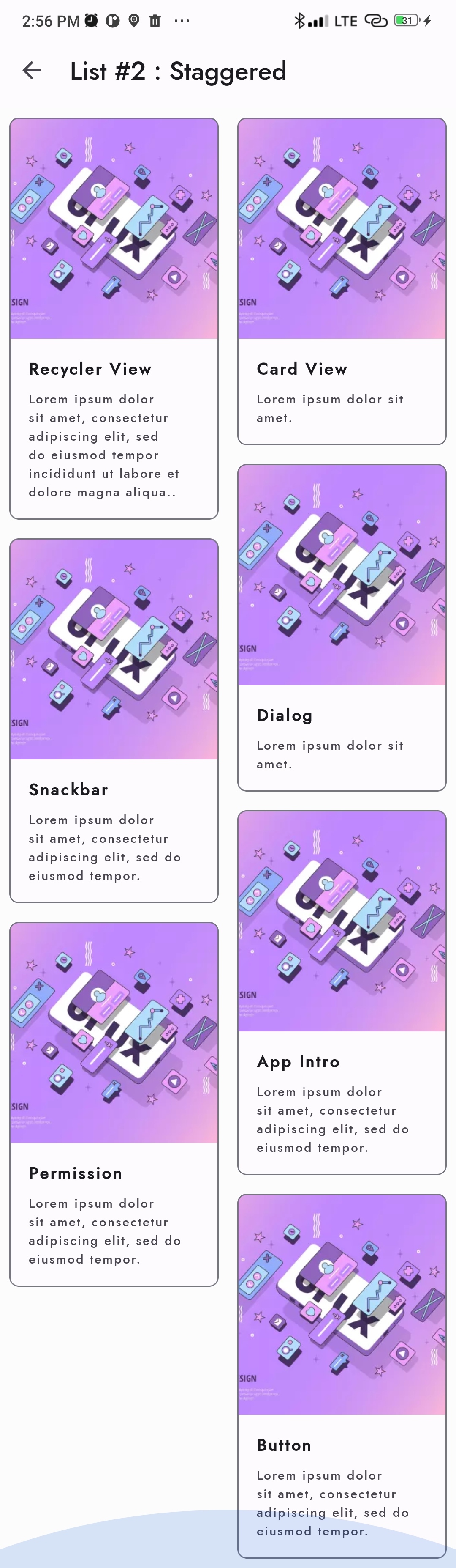
..
Let us create a recyclerview
Step 1:
Create data class name is Components. kt
package com.boltuix.myapplication.model

import com.boltuix.myapplication.R

data class Components(
    val label: String,
    val drawable: Int?= R.drawable.ic_launcher_background,
    val description: String?="",
)
Step 2:
Create a view model ComponentsViewModel.kt, we added some dummy data to the array list of data classes finally, we will set data to mutual live data
package com.boltuix.myapplication

import androidx.lifecycle.MutableLiveData
import androidx.lifecycle.ViewModel
import com.boltuix.myapplication.model.Components

class ComponentsViewModel : ViewModel() {
    val liveNewsData = MutableLiveData<ArrayList<Components>>()
    private var recyclerItemModels  =   ArrayList<Components>()

    init {
        fetchSampleData()
    }
     private fun fetchSampleData(){
        recyclerItemModels.clear()
        recyclerItemModels.add(Components("All buttons", R.drawable.m3_green_banner,"When choosing the right button for an action, consider the level of emphasis inherent to a button type."))
        recyclerItemModels.add(Components("Cards", R.drawable.m3_red_banner,"Cards contain content and actions that relate information about a subject."))
        recyclerItemModels.add(Components("Chips", R.drawable.m3_green_banner,"Chips help people enter information, make selections, filter content, or trigger actions. Chips can use multiple interactive elements in the same area, such as a list or menu."))
        recyclerItemModels.add(Components("Dialogs", R.drawable.m3_red_banner_mini,"Dialogs provide important prompts in a user flow. They can require an action, communicate information, or help users accomplish a task."))
        recyclerItemModels.add(Components("Navigation bar", R.drawable.m3_yellow_banner,"Navigation bars offer a persistent and convenient way to switch between primary destinations in an app."))
        recyclerItemModels.add(Components("Navigation drawer", R.drawable.m3_yellow_banner,"Navigation drawers provide ergonomic access to destinations in an app."))
        recyclerItemModels.add(Components("Navigation rail", R.drawable.m3_yellow_banner,"Navigation rails provide access to primary destinations in apps when using tablet and desktop screens."))
        recyclerItemModels.add(Components("Top app bars", R.drawable.m3_yellow_banner,"Top app bars display information and actions at the top of a screen."))
        recyclerItemModels.add(Components("Widgets", R.drawable.m4_blue_banner,"Widgets for Android phones, fordable devices, and tablets have a new look and feel."))
        recyclerItemModels.add(Components("Typography", R.drawable.m3_typo,"Material's default type scale includes a range of contrasting and extensible styles to support a wide range of use cases."))
        recyclerItemModels.add(Components("On boarding", R.drawable.m3_typo,"On boarding is a virtual unboxing experience that helps users get started with an app."))
        recyclerItemModels.add(Components("Request Permission", R.drawable.m3_red_banner,"Permission requests should be simple, transparent, and understandable."))
        liveNewsData.value = recyclerItemModels
    }
}
Step 3:
Create a adapter ComponentsAdapter.kt
package com.boltuix.myapplication.adapter

import android.util.Log
import android.view.LayoutInflater
import android.view.ViewGroup
import androidx.recyclerview.widget.AsyncListDiffer
import androidx.recyclerview.widget.DiffUtil
import androidx.recyclerview.widget.RecyclerView
import com.boltuix.myapplication.databinding.ComponentsRecyclerViewDesignBinding
import com.boltuix.myapplication.model.Components

class ComponentsAdapterViewHolder(val bindingDesign: ComponentsRecyclerViewDesignBinding) : RecyclerView.ViewHolder(bindingDesign.root)

class ComponentsAdapter(private val event: (ComponentsRecyclerViewDesignBinding, Components) -> Unit) : RecyclerView.Adapter<ComponentsAdapterViewHolder>() {

    private val itemDifferCallback = object: DiffUtil.ItemCallback<Components>(){
        override fun areItemsTheSame(oldItem: Components, newItem: Components): Boolean {
            return oldItem.label == newItem.label
        }

        override fun areContentsTheSame(oldItem: Components, newItem: Components): Boolean {
            return oldItem == newItem
        }

    }
    // to do job asynchronously
    val itemDiffer = AsyncListDiffer(this, itemDifferCallback)

    override fun onCreateViewHolder(parent: ViewGroup, viewType: Int): ComponentsAdapterViewHolder {
        return ComponentsAdapterViewHolder(
            ComponentsRecyclerViewDesignBinding.inflate(LayoutInflater.from(parent.context), parent, false)
        )
    }

    override fun onBindViewHolder(holder: ComponentsAdapterViewHolder, position: Int) {
        val currentItem = itemDiffer.currentList[position]
        with(holder) {
            Log.d("s1001","::: onBindViewHolder")
            bindingDesign.apply {

                titleText.text = currentItem.label

                descriptionText.text = currentItem.description

                imageViewCircleWithStroke.setImageResource(currentItem.drawable!!)

                cardView.setOnClickListener {
                    event(holder.bindingDesign,currentItem)
                }
            }
        }
    }

    override fun getItemCount(): Int = itemDiffer.currentList.size
    fun submitList(list: List<Components?>?) {
        itemDiffer.submitList(list)
    }

}
Step 4:
Create a fragment ComponentsFragment.kt
package com.boltuix.myapplication

import android.os.Bundle
import android.view.LayoutInflater
import android.view.View
import android.view.ViewGroup
import androidx.fragment.app.Fragment
import androidx.fragment.app.viewModels
import androidx.recyclerview.widget.LinearLayoutManager
import com.boltuix.myapplication.adapter.ComponentsAdapter
import com.boltuix.myapplication.databinding.ComponentsRecyclerViewBinding
import com.google.android.material.snackbar.Snackbar

class ComponentsFragment : Fragment() {
    private var _binding: ComponentsRecyclerViewBinding? = null

    private lateinit var adapterOrder: ComponentsAdapter

    private val viewModel: ComponentsViewModel by viewModels()

    // This property is only valid between onCreateView and
    // onDestroyView.
    private val binding get() = _binding!!

    override fun onCreateView(
        inflater: LayoutInflater, container: ViewGroup?,
        savedInstanceState: Bundle?,
    ): View {

        _binding = ComponentsRecyclerViewBinding.inflate(inflater, container, false)
        return binding.root

    }

    override fun onViewCreated(view: View, savedInstanceState: Bundle?) {
        super.onViewCreated(view, savedInstanceState)

        binding.recyclerView.apply {

            //TYPE 1
            // layoutManager = LinearLayoutManager(context, LinearLayoutManager.HORIZONTAL, false)

            //TYPE 2
            //layoutManager = LinearLayoutManager(context, LinearLayoutManager.VERTICAL, false)

            //TYPE 3
            //layoutManager = GridLayoutManager(context,2)

            //TYPE 4
            // layoutManager = StaggeredGridLayoutManager(2, LinearLayoutManager.VERTICAL)

            layoutManager = LinearLayoutManager(context, LinearLayoutManager.HORIZONTAL, false)
            hasFixedSize()

            adapterOrder = ComponentsAdapter(event = { _, item ->
                Snackbar.make(binding.recyclerView, item.description.toString(), Snackbar.LENGTH_LONG)
                    .setAction("Action", null).show()
            })
            adapter= adapterOrder
        }

        viewModel.liveNewsData.observe(viewLifecycleOwner) { response ->
            //adapterOrder.itemDiffer.submitList(response)
            adapterOrder.submitList(response)
        }
    }

    override fun onDestroyView() {
        super.onDestroyView()
        _binding = null
    }
}
Step 5:
Create a recycler view widget layout in the layout folder, the name is components_recycler_view.xml
<?xml version="1.0" encoding="utf-8"?>
<androidx.recyclerview.widget.RecyclerView
    xmlns:android="http://schemas.android.com/apk/res/android"
    xmlns:app="http://schemas.android.com/apk/res-auto"
    xmlns:tools="http://schemas.android.com/tools"
    android:id="@+id/recycler_view"
    android:layout_width="match_parent"
    android:layout_height="match_parent"
    android:background="#fcfcfc"
    tools:listitem="@layout/components_recycler_view_design"/>
Step 6:
Create a design view for the layout, the name is components_recycler_view_design.xml
<?xml version="1.0" encoding="utf-8"?>
<com.google.android.material.card.MaterialCardView android:id="@+id/card"
    android:layout_width="match_parent"
    android:layout_height="wrap_content"
    android:layout_margin="8dp"
    xmlns:android="http://schemas.android.com/apk/res/android"
    xmlns:app="http://schemas.android.com/apk/res-auto">

    <LinearLayout
        android:id="@+id/cardView"
        android:layout_width="match_parent"
        android:layout_height="wrap_content"
        android:orientation="vertical">

        <ImageView
            android:id="@+id/imageViewCircleWithStroke"
            android:layout_width="match_parent"
            android:layout_height="194dp"
            app:srcCompat="@drawable/m3_green_banner"
            android:scaleType="centerCrop"
            android:contentDescription="none"
            />

        <LinearLayout
            android:layout_width="match_parent"
            android:layout_height="wrap_content"
            android:orientation="vertical"
            android:padding="16dp">

            <TextView
                android:id="@+id/titleText"
                android:layout_width="wrap_content"
                android:layout_height="wrap_content"
                android:text="@string/app_name"
                android:textAppearance="?attr/textAppearanceHeadline6"
                />
            <TextView
                android:id="@+id/descriptionText"
                android:layout_width="wrap_content"
                android:layout_height="wrap_content"
                android:layout_marginTop="8dp"
                android:text="@string/app_name"
                android:textAppearance="?attr/textAppearanceBody2"
                android:textColor="?android:attr/textColorSecondary"
                />
        </LinearLayout>
    </LinearLayout>
</com.google.android.material.card.MaterialCardView>
..
Tags:
Android
