The AppBar widget is a key component in building mobile applications with Flutter.
It allows you to create navigation bars that can contain buttons, icons, and other widgets to help users navigate through your app.
In this tutorial, we will explore how to use the AppBar widget in Flutter to create beautiful and functional navigation bars.
The App bar provides content and actions related to the current screen. It's used for branding, screen titles, navigation, and actions
Demo 1:
import 'package:flutter/material.dart';

void main() => runApp(MyApp());

class MyApp extends StatelessWidget {
  @override
  Widget build(BuildContext context) {
    return MaterialApp(
      title: 'Flutter AppBar Widget',
      home: Scaffold(
        appBar: AppBar(
          title: Text('My App'),
        ),
        body: Center(
          child: Text('Hello World'),
        ),
      ),
    );
  }
}
..
Step by Step Code Explanation:
- Import the necessary packages: import 'package:flutter/material.dart';
- Create a main() method to start the application: void main() => runApp(MyApp());
- Create a MyApp class that extends StatelessWidget:
class MyApp extends StatelessWidget {
  @override
  Widget build(BuildContext context) {
    ...
  }
}
..
- In the build method of MyApp, return a MaterialApp widget that contains a Scaffold widget:
return MaterialApp(
  title: 'Flutter AppBar Widget',
  home: Scaffold(
    ...
  ),
);
..
- Inside the Scaffold widget, create an AppBar widget:
appBar: AppBar(
  title: Text('My App'),
),
..
- Add a Text widget to the body of the Scaffold:
body: Center(
  child: Text('Hello World'),
),
Run the app and you should see a simple app with an AppBar and a centered "Hello World" text.
..
Demo 2:
import 'package:flutter/material.dart';

class AppBarDemo extends StatelessWidget {
  const AppBarDemo({super.key}); // Constructor for the AppBarDemo class

  @override
  Widget build(BuildContext context) { // The build method that returns the widget tree
    return Scaffold( // The main widget for creating screen layouts in Flutter
      appBar: AppBar( // The app bar widget for adding a top navigation bar
        leading: IconButton( // An icon button for the app drawer or a menu
          tooltip: MaterialLocalizations.of(context).openAppDrawerTooltip, // A tooltip for the button
          icon: const Icon(Icons.menu), // The menu icon
          onPressed: () {}, // An empty method that can be replaced with custom functionality
        ),
        title: const Text( // A text widget for the app title
          'App bar', // The text to be displayed as the title
        ),
        actions: [ // A list of widgets for the actions in the app bar
          IconButton( // An icon button for a favorite action
            tooltip: 'Favorite', // A tooltip for the button
            icon: const Icon( // The favorite icon
              Icons.favorite,
            ),
            onPressed: () {}, // An empty method that can be replaced with custom functionality
          ),
          IconButton( // An icon button for a search action
            tooltip: 'Search', // A tooltip for the button
            icon: const Icon( // The search icon
              Icons.search,
            ),
            onPressed: () {}, // An empty method that can be replaced with custom functionality
          ),
          PopupMenuButton<Text>( // A popup menu button for additional menu options
            itemBuilder: (context) { // A method that returns the menu options as widgets
              return [
                const PopupMenuItem( // A menu item widget with the text "Menu 1"
                  child: Text(
                    'Menu 1',
                  ),
                ),
                const PopupMenuItem( // A menu item widget with the text "Menu 2"
                  child: Text(
                    'Menu 2',
                  ),
                ),
                const PopupMenuItem( // A menu item widget with the text "Menu 3"
                  child: Text(
                    'Menu 3',
                  ),
                ),
              ];
            },
          )
        ],
      ),
      body: const Center( // The main content of the screen
        child: Text( // A text widget with the text "Home"
          'Home',
        ),
      ),
    );
  }
}
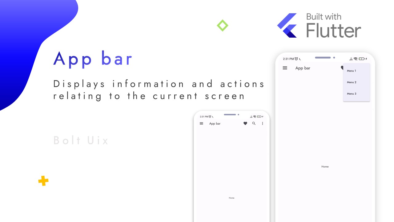
The AppBarDemo class extends StatelessWidget and overrides the build method. The build method returns a Scaffold widget, which is the primary widget used for creating screen layouts in Flutter.
Inside the Scaffold, an AppBar widget is added as the top navigation bar of the screen.
The AppBar has the following properties:
- leading: An icon button with the Icons.menu icon that represents the app drawer or a menu. When this button is pressed, it calls the empty onPressed method, which can be replaced with custom functionality.
- title: A Text widget that displays the title of the app or screen. In this case, the title is "App bar".
- actions: A list of widgets that represent the actions that the user can take in the app. In this case, there are two IconButtons and a PopupMenuButton.
The first IconButton has the Icons.favorite icon and the tooltip "Favorite". When pressed, it calls the empty onPressed method.
The second IconButton has the Icons.search icon and the tooltip "Search". When pressed, it calls the empty onPressed method.
The PopupMenuButton has a list of three PopupMenuItems that are displayed when the button is pressed. The PopupMenuItems have the text "Menu 1", "Menu 2", and "Menu 3".
Finally, the body of the Scaffold is a Center widget that contains a Text widget with the text "Home".
Overall, this code demonstrates how to create an AppBar in a mobile application with custom actions and a popup menu.
..


..
