
The Divider widget is a UI element that creates horizontal and vertical lines that separate content. With this guide, you will learn how to use the Divider widget to create visually appealing interfaces in your Flutter applications.
Let us create horizontal and vertical dividers, customizing the divider's appearance, and using dividers in different contexts.

A divider is a thin line that groups content in lists and layouts.
import 'package:flutter/material.dart';

class MyHomePage extends StatelessWidget {
  @override
  Widget build(BuildContext context) {
    return Scaffold(
      appBar: AppBar(
        title: Text('Divider Example'),
      ),
      body: Center(
        child: Column(
          mainAxisAlignment: MainAxisAlignment.center,
          children: <Widget>[
            Text('Above Divider'), // Text widget above the first Divider
            Divider(), // Creates a horizontal line
            Text('Below Divider'), // Text widget below the first Divider
            Divider(
              thickness: 2, // Sets the thickness of the Divider to 2 pixels
              color: Colors.red, // Sets the color of the Divider to red
            ), // Creates a customized divider
          ],
        ),
      ),
    );
  }
}
Step-by-Step Code Explanation:
- Import the material package from Flutter.
- Create a stateless widget called MyHomePage.
- In the build method, return a Scaffold widget that contains an AppBar and a body.
- In the body of the Scaffold, create a Center widget that contains a Column.
- Inside the Column, add two Text widgets that display the text "Above Divider" and "Below Divider".
- Add a Divider widget in between the two Text widgets to create a horizontal line.
- Add another Divider widget with a thickness of 2 and a red color to create a customized divider.
- Save and run the code to see the dividers in action.
..
Example:
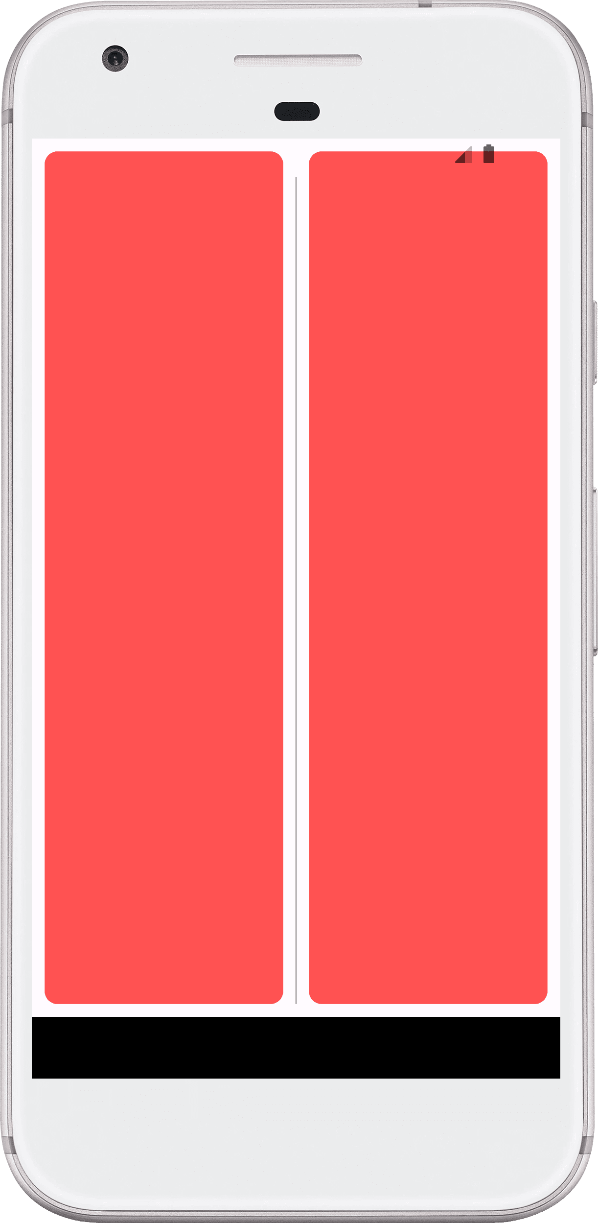
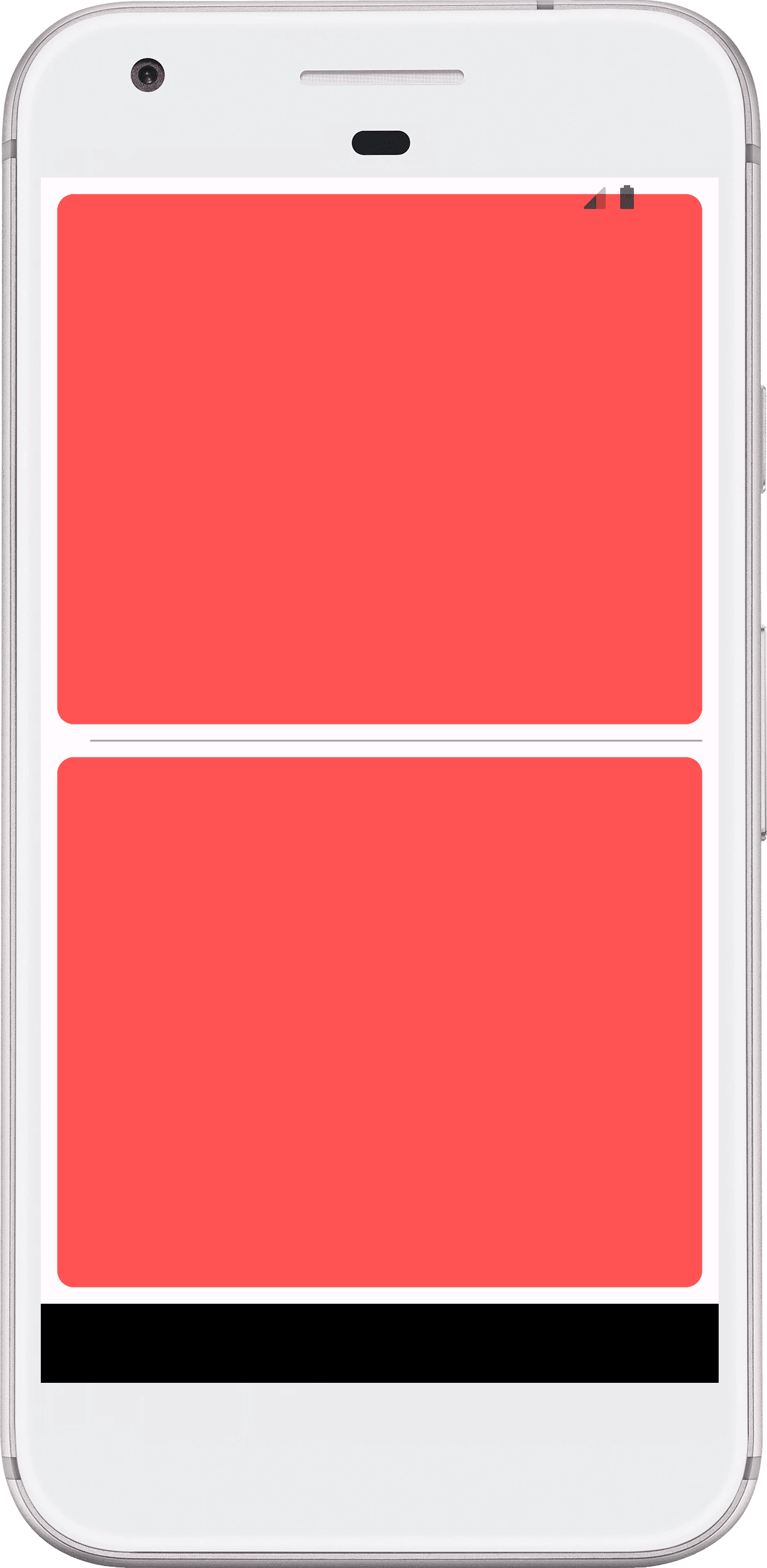
DividerDemoHorizontal() // Horizontal divider line
DividerDemoVertical() // Vertical divider line
import 'package:flutter/material.dart';
class DividerDemoHorizontal extends StatelessWidget {
const DividerDemoHorizontal({super.key});
@override
Widget build(BuildContext context) {
return
Scaffold(
body: Container(
padding: const EdgeInsets.all(10),
child: Column(
children: [
Expanded(
child: Container(
decoration: BoxDecoration(
borderRadius: BorderRadius.circular(10),
color: Colors.redAccent,
),
),
),
const Divider(
color: Colors.grey,
height: 20,
thickness: 1,
indent: 20,
endIndent: 0,
),
Expanded(
child: Container(
decoration: BoxDecoration(
borderRadius: BorderRadius.circular(10),
color: Colors.redAccent,
),
),
),
],
),
),
);
}
}
class DividerDemoVertical extends StatelessWidget {
const DividerDemoVertical({super.key});
@override
Widget build(BuildContext context) {
return
Scaffold(
body: Container(
padding: const EdgeInsets.all(10),
child: Row(
children: [
Expanded(
child: Container(
decoration: BoxDecoration(
borderRadius: BorderRadius.circular(10),
color: Colors.redAccent,
),
),
),
const VerticalDivider(
color: Colors.grey,
thickness: 1,
indent: 20,
endIndent: 0,
width: 20,
),
Expanded(
child: Container(
decoration: BoxDecoration(
borderRadius: BorderRadius.circular(10),
color: Colors.redAccent,
),
),
),
],
),
),
);
}
}
..
How to Fix Vertical Divider Not Showing in Flutter App
When you add Vertical Divider inside Row, Wrap widget, it may not display, or display with irregular height. The main reason of this reason is the unrestricted height of the parent widget of Row/Wrap widget. See the example below to solve this issue.
Solution : Wrap Row() with IntrinsicHeight()
Full Code Example:
import 'package:flutter/material.dart';
class DividerDemo extends StatelessWidget {
const DividerDemo({super.key});
@override
Widget build(BuildContext context) {
return
Scaffold(
body: SingleChildScrollView(
child: Column(
mainAxisAlignment: MainAxisAlignment.center,
children: [
Container(height: 35),
// Vertical Divider
Card(
shape: RoundedRectangleBorder( borderRadius: BorderRadius.circular(4),),
clipBehavior: Clip.antiAliasWithSaveLayer,
child: Padding(
padding: const EdgeInsets.all(15),
child:
IntrinsicHeight(
child: Row(
crossAxisAlignment: CrossAxisAlignment.start,
children: <Widget>[
Expanded(
child: Column(
crossAxisAlignment : CrossAxisAlignment.start,
children: <Widget>[
Container(height: 5),
Text("Demos Title",style: Theme.of(context).textTheme.headlineMedium),
Container(height: 5),
Text("Bolt UiX", style: Theme.of(context).textTheme.titleMedium),
Container(height: 10),
const Text('A divider is a thin line that groups content in lists and containers.'),
],
),
),
Container(width: 10),
const VerticalDivider(),
Container(width: 10),
Column(
crossAxisAlignment: CrossAxisAlignment.start,
children: <Widget>[
const Text("Tonight's availability",style : TextStyle(fontWeight: FontWeight.bold),),
Container(height: 5),
ElevatedButton(
style: ElevatedButton.styleFrom(
backgroundColor: Colors.grey[300], elevation: 0,
padding: const EdgeInsets.symmetric(vertical: 0, horizontal: 20),
shape: RoundedRectangleBorder(borderRadius: BorderRadius.circular(18.0)),
),
child: const Text("5:30PM"),
onPressed: (){},
),
Container(width: 8),
ElevatedButton(
style: ElevatedButton.styleFrom(
backgroundColor: Colors.grey[300], elevation: 0,
padding: const EdgeInsets.symmetric(vertical: 0, horizontal: 20),
shape: RoundedRectangleBorder(borderRadius: BorderRadius.circular(18.0)),
),
child: const Text("7:30PM"),
onPressed: (){},
),
],
),
],
),
)
),
),
// Vertical Divider
Card(
shape: RoundedRectangleBorder(borderRadius: BorderRadius.circular(6)),
clipBehavior: Clip.antiAliasWithSaveLayer,
child: Column(
crossAxisAlignment: CrossAxisAlignment.start,
children: <Widget>[
IntrinsicHeight(
child: Row(
mainAxisAlignment: MainAxisAlignment.spaceEvenly,
crossAxisAlignment: CrossAxisAlignment.center,
children: const [
SizedBox(width: 10),
Icon(Icons.menu),
SizedBox(width: 10),
Expanded(child: TextField(
style: TextStyle(fontSize: 16),
decoration: InputDecoration(
hintText: "Your Current Location",
focusedBorder: InputBorder.none,
),)),
SizedBox(width: 5),
VerticalDivider(color: Color(0x84FF8A80),
thickness: 2,
indent: 0,
endIndent: 0,
width: 2,),
SizedBox(width: 5),
Icon(Icons.filter_tilt_shift),
SizedBox(width: 10),
],),
),
],
),
),
Container(height: 25),
// Horizontal Divider
Card(
shape: RoundedRectangleBorder(borderRadius: BorderRadius.circular(6)),
clipBehavior: Clip.antiAliasWithSaveLayer,
child: Column(
crossAxisAlignment: CrossAxisAlignment.start,
children: <Widget>[
Image.asset( 'assets/images/test.webp',
height: 180, width: double.infinity, fit: BoxFit.cover,
),
Container(
padding: const EdgeInsets.all(15),
child: Column(
crossAxisAlignment: CrossAxisAlignment.start,
children: <Widget>[
Text("Card Title", style: Theme.of(context).textTheme.headlineMedium),
Container(
margin: const EdgeInsets.symmetric(vertical: 10),
child: Text("Sub title", style: Theme.of(context).textTheme.titleMedium),
),
const Text('A divider is a thin line that groups content in lists and containers.'),
],
),
),
Container(
margin: const EdgeInsets.symmetric(horizontal: 15),
child: const Divider(height: 1),
),
Container(
padding: const EdgeInsets.all(15),
child: Column(
crossAxisAlignment: CrossAxisAlignment.start,
children: <Widget>[
const Text("Tonight's availability",style : TextStyle(fontWeight: FontWeight.bold),),
Container(height: 5),
Row(
children: [
ElevatedButton(
style: ElevatedButton.styleFrom(
backgroundColor: Colors.grey[300], elevation: 0,
padding: const EdgeInsets.symmetric(vertical: 0, horizontal: 20),
shape: RoundedRectangleBorder(borderRadius: BorderRadius.circular(18.0)),
),
child: const Text("5:30PM"),
onPressed: (){},
),
Container(width: 8),
ElevatedButton(
style: ElevatedButton.styleFrom(
backgroundColor: Colors.grey[300], elevation: 0,
padding: const EdgeInsets.symmetric(vertical: 0, horizontal: 20),
shape: RoundedRectangleBorder(borderRadius: BorderRadius.circular(18.0)),
),
child: const Text("7:30PM"),
onPressed: (){},
),
Container(width: 8),
ElevatedButton(
style: ElevatedButton.styleFrom(
backgroundColor: Colors.grey[300], elevation: 0,
padding: const EdgeInsets.symmetric(vertical: 0, horizontal: 20),
shape: RoundedRectangleBorder(borderRadius: BorderRadius.circular(18.0)),
),
child: const Text("8:00PM"),
onPressed: (){},
),
],
)
],
),
),
],
),
),
// Horizontal Divider : Custom
Card(
shape: RoundedRectangleBorder(borderRadius: BorderRadius.circular(6)),
clipBehavior: Clip.antiAliasWithSaveLayer,
child: Column(
crossAxisAlignment: CrossAxisAlignment.start,
children: <Widget>[
Image.asset( 'assets/images/test.webp',
height: 180, width: double.infinity, fit: BoxFit.cover,
),
Container(
padding: const EdgeInsets.all(15),
child: Column(
crossAxisAlignment: CrossAxisAlignment.start,
children: <Widget>[
Text("Card Title", style: Theme.of(context).textTheme.headlineMedium),
Container(
margin: const EdgeInsets.symmetric(vertical: 10),
child: Text("Sub title", style: Theme.of(context).textTheme.titleMedium),
),
const Text('A divider is a thin line that groups content in lists and containers.'),
],
),
),
Container(
margin: const EdgeInsets.symmetric(horizontal: 15),
child: const Divider(
color: Colors.purpleAccent,
height: 20,
thickness: 1,
indent: 20,
endIndent: 0,
),
),
Container(
padding: const EdgeInsets.all(15),
child: Column(
crossAxisAlignment: CrossAxisAlignment.start,
children: <Widget>[
const Text("Tonight's availability",style : TextStyle(fontWeight: FontWeight.bold),),
Container(height: 5),
Row(
children: [
ElevatedButton(
style: ElevatedButton.styleFrom(
backgroundColor: Colors.grey[300], elevation: 0,
padding: const EdgeInsets.symmetric(vertical: 0, horizontal: 20),
shape: RoundedRectangleBorder(borderRadius: BorderRadius.circular(18.0)),
),
child: const Text("5:30PM"),
onPressed: (){},
),
Container(width: 8),
ElevatedButton(
style: ElevatedButton.styleFrom(
backgroundColor: Colors.grey[300], elevation: 0,
padding: const EdgeInsets.symmetric(vertical: 0, horizontal: 20),
shape: RoundedRectangleBorder(borderRadius: BorderRadius.circular(18.0)),
),
child: const Text("7:30PM"),
onPressed: (){},
),
Container(width: 8),
ElevatedButton(
style: ElevatedButton.styleFrom(
backgroundColor: Colors.grey[300], elevation: 0,
padding: const EdgeInsets.symmetric(vertical: 0, horizontal: 20),
shape: RoundedRectangleBorder(borderRadius: BorderRadius.circular(18.0)),
),
child: const Text("8:00PM"),
onPressed: (){},
),
],
)
],
),
),
],
),
),
],
),
)
);
}
}
..Divider widgets in different contexts.
The demo includes four Card widgets, each of which contains a different example of using Divider widgets.
- The first Card widget contains a Row with two columns separated by a vertical Divider widget. The first column contains a Column widget with some text, while the second column contains another Column widget with some text and two ElevatedButton widgets.
- The second Card widget contains a Row with four widgets: an Icon widget, a TextField widget, a vertical Divider widget, and another Icon widget.
- The third Card widget contains an Image widget, followed by some text and a horizontal Divider widget, and then some more text and three ElevatedButton widgets.
- The fourth Card widget contains an Image widget, followed by some text and a horizontal Custom Divider widget, and then some more text and three ElevatedButton widgets.
Overall, this code demonstrates how Divider widgets can be used to separate content visually in different contexts, such as rows, columns, and cards.
..
Usage
Dividers are one way to visually group components and create hierarchy. They can also be used to imply nested parent/child relationships.
There are two types of dividers:
- Full width

- Inset

