View all the Material Components in Jetpack Compose.
Jetpack Compose offers an implementation of Material Design, a comprehensive design system for creating digital interfaces. The Material Design components (buttons, cards, switches, and so on) are built on top of Material Theming, which is a systematic way to customize Material Design to better reflect your product’s brand.
A Material Theme contains color, typography, and shape attributes. When you customize these attributes, your changes are automatically reflected in the components you use to build your app.
Demo app: https://play.google.com/store/apps/details?id=compose.material.theme
Source code: https://www.boltuix.com/search/label/*%20Jetpack%20Compose
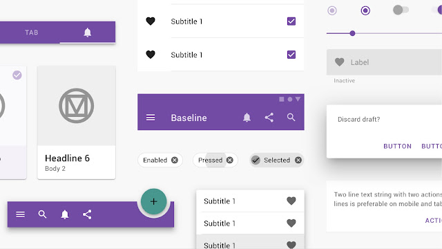
Components
Material Components are interactive building blocks for creating a user interface.
* App bars: bottom
* App bars: top
* Backdrop
* Banners
* Bottom navigation
* Buttons
* Buttons: floating action button
* Cards
* Dialogs
* Dividers
* Image lists
* Lists
* Menus
* Navigation drawer
* Navigation rail
* Progress indicators
* Selection controls
* Sheets: bottom
* Sheets: side
* Sliders
* Snack bars
* Tabs
* Text fields
* Swipe to refresh
* Ice cream UI design template
You will get more updates.
You will get more updates.


Tags:
Jetpack Compose
