Buttons help people initiate actions, from sending an email to sharing a document, to liking a post.
Usage
Buttons communicate actions that users can take. They are typically placed throughout your UI, in places like:
- Dialogs
- Modal windows
- Forms
- Cards
- Toolbars
Example
Buttons are just one option for representing actions in a product and shouldn’t be overused. Too many buttons on a screen disrupt the visual hierarchy.

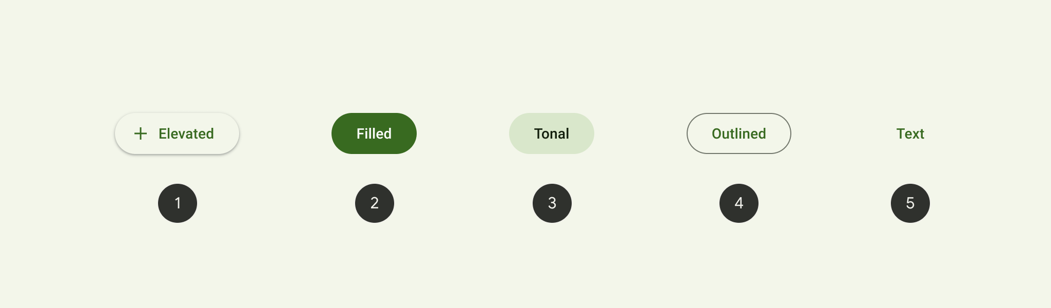
- Elevated button
- Filled button
- Filled tonal button
- Outlined button
- Text button
- Choose the type of button based on the importance of the action. The more important the action is, the more emphasis its button should have.
- All buttons have fully rounded corners
- There are four common color mappings for buttons, each with a light and dark theme.
- Color: New color mappings and compatibility with dynamic color. Icons and labels now share the same color.
- Icons: Standard size for leading and trailing icons is now 18dp
- Shape: Fully rounded corner radius, taller height, and new minimum width
- Typography: Button text is in sentence case, no ALL CAPS
- Types: Three new button types – elevated button, filled button, and filled tonal button – replace what was previously known as contained button
Eg:

Text button
Text buttons have less visual prominence, so should be used for low emphasis actions, such as when presenting multiple options.
 <com.google.android.material.button.MaterialButton
                android:id="@+id/btn_text"
                android:layout_width="wrap_content"
                android:layout_height="wrap_content"
                android:text="Text button"
                style="@style/Widget.Material3.Button.TextButton"
                />
..
Adding an icon to a text button
The following example shows a text button with an icon.
 <com.google.android.material.button.MaterialButton
                android:layout_width="wrap_content"
                android:layout_height="wrap_content"
                android:text="Text button"
                app:icon="@drawable/ic_baseline_add_24"
                style="@style/Widget.Material3.Button.TextButton"
                />
..
Outlined button
Outlined buttons are for actions that need attention but aren’t the primary action, such as “See all” or “Add to cart.” This is also the button used to give someone the opportunity to change their mind or escape a flow.
The following example shows an outlined button with a text label and a stroked container.
 <com.google.android.material.button.MaterialButton
                android:layout_width="wrap_content"
                android:layout_height="wrap_content"
                android:text="Outlined button"
                style="?attr/materialButtonOutlinedStyle"
                />
..
Adding an icon to a Outline button
The following example shows a outline button with an icon.
<com.google.android.material.button.MaterialButton
                android:layout_width="wrap_content"
                android:layout_height="wrap_content"
                android:text="Adding an icon to a Outlined button"
                app:icon="@drawable/ic_baseline_add_24"
                style="@style/Widget.Material3.Button.OutlinedButton.Icon"
                />
..
Filled button
Filled button's contrasting surface color makes it the most prominent button after the FAB. It’s used for final or unblocking actions in a flow.
Note The filled button is the default style if the style is not set.
The following example shows a filled button with a text label and a filled container.
<com.google.android.material.button.MaterialButton
                android:layout_width="wrap_content"
                android:layout_height="wrap_content"
                android:text="Filled button"
                />
..
Adding an icon to a Filled button
The following example shows a Filled button with an icon.
<com.google.android.material.button.MaterialButton
                android:layout_width="wrap_content"
                android:layout_height="wrap_content"
                android:text="Adding an icon to a Filled button"
                app:icon="@drawable/ic_baseline_add_24"
                style="@style/Widget.Material3.Button.Icon"
                />
..
Filled tonal button
Filled tonal buttons have a lighter background color and darker label color, making them less visually prominent than a regularly filled button. They’re still used for final or unblocking actions in a flow, but may be better when these actions don’t require quite so much emphasis.
The following example shows a filled tonal button with a text label and a filled container.
<com.google.android.material.button.MaterialButton
                android:layout_width="wrap_content"
                android:layout_height="wrap_content"
                android:text="Filled button: Tonal style"
                style="@style/Widget.Material3.Button.TonalButton"
                />
..
Adding an icon to a Tonal button
The following example shows a tonal button with an icon.
<com.google.android.material.button.MaterialButton
                android:layout_width="wrap_content"
                android:layout_height="wrap_content"
                android:text="Adding an icon to a Tonal button"
                app:icon="@drawable/ic_baseline_add_24"
                style="@style/Widget.Material3.Button.TonalButton.Icon"
                />
..
Elevated button
Elevated buttons are essentially outlined buttons with a shadow. To prevent shadow creep, only use them when absolutely necessary, such as when the button requires visual separation from a patterned background.
The following example shows an elevated button with a text label.
<com.google.android.material.button.MaterialButton
                android:layout_width="wrap_content"
                android:layout_height="wrap_content"
                android:text="Elevated button"
                style="@style/Widget.Material3.Button.ElevatedButton"
                />
..
Adding an icon to an elevated button
The following example shows an elevated button with an icon.
<com.google.android.material.button.MaterialButton
                android:layout_width="wrap_content"
                android:layout_height="wrap_content"
                android:text="Adding an icon to an elevated button"
                app:icon="@drawable/ic_baseline_add_24"
                style="@style/Widget.Material3.Button.ElevatedButton.Icon"
                />
..
Toggle button
    <com.google.android.material.button.MaterialButtonToggleGroup
                android:paddingTop="8dp"
                android:id="@+id/toggleButton"
                android:layout_width="wrap_content"
                android:layout_height="wrap_content">
                <com.google.android.material.button.MaterialButton
                    android:id="@+id/button1"
                    android:layout_width="wrap_content"
                    android:layout_height="wrap_content"
                    android:text="Button 1"
                    style="?attr/materialButtonOutlinedStyle"
                    />
                <com.google.android.material.button.MaterialButton
                    android:id="@+id/button2"
                    android:layout_width="wrap_content"
                    android:layout_height="wrap_content"
                    android:text="Button 2"
                    style="?attr/materialButtonOutlinedStyle"
                    />
                <com.google.android.material.button.MaterialButton
                    android:id="@+id/button3"
                    android:layout_width="wrap_content"
                    android:layout_height="wrap_content"
                    android:text="Button 3"
                    style="?attr/materialButtonOutlinedStyle"
                    />
            </com.google.android.material.button.MaterialButtonToggleGroup>
..
Implementing an icon-only toggle button
 <com.google.android.material.button.MaterialButtonToggleGroup
                android:paddingTop="8dp"
                android:layout_width="wrap_content"
                android:layout_height="wrap_content">
                <com.google.android.material.button.MaterialButton
                    android:layout_width="wrap_content"
                    android:layout_height="wrap_content"
                    app:icon="@drawable/ic_baseline_format_align_center_24"
                    style="@style/Widget.App.Button.OutlinedButton.IconOnly"
                    />
                <com.google.android.material.button.MaterialButton
                    android:layout_width="wrap_content"
                    android:layout_height="wrap_content"
                    app:icon="@drawable/ic_baseline_format_align_left_24"
                    style="@style/Widget.App.Button.OutlinedButton.IconOnly"
                    />
                <com.google.android.material.button.MaterialButton
                    android:layout_width="wrap_content"
                    android:layout_height="wrap_content"
                    app:icon="@drawable/ic_baseline_format_align_right_24"
                    style="@style/Widget.App.Button.OutlinedButton.IconOnly"
                    />
</com.google.android.material.button.MaterialButtonToggleGroup>
..
Icon toggle button
<com.google.android.material.checkbox.MaterialCheckBox
                android:layout_width="wrap_content"
                android:layout_height="wrap_content"
                android:button="@drawable/sl_favourite_24dp"
                app:buttonTint="@color/md_theme_light_primary"
                />
in the drawable: sl_favourite_24dp.xml
<selector xmlns:android="http://schemas.android.com/apk/res/android">
    <item
        android:drawable="@drawable/ic_baseline_favorite_border_24"
        android:state_checked="false"
        />
    <item
        android:drawable="@drawable/ic_baseline_favorite_24"
        android:state_checked="true"
        />
    <item android:drawable="@drawable/ic_baseline_favorite_border_24" />
</selector>
in the drawable: ic_baseline_favorite_border_24.xml
<vector xmlns:android="http://schemas.android.com/apk/res/android"
    android:width="24dp"
    android:height="24dp"
    android:viewportWidth="24"
    android:viewportHeight="24"
    android:tint="?attr/colorControlNormal">
  <path
      android:fillColor="@android:color/white"
      android:pathData="M16.5,3c-1.74,0 -3.41,0.81 -4.5,2.09C10.91,3.81 9.24,3 7.5,3 4.42,3 2,5.42 2,8.5c0,3.78 3.4,6.86 8.55,11.54L12,21.35l1.45,-1.32C18.6,15.36 22,12.28 22,8.5 22,5.42 19.58,3 16.5,3zM12.1,18.55l-0.1,0.1 -0.1,-0.1C7.14,14.24 4,11.39 4,8.5 4,6.5 5.5,5 7.5,5c1.54,0 3.04,0.99 3.57,2.36h1.87C13.46,5.99 14.96,5 16.5,5c2,0 3.5,1.5 3.5,3.5 0,2.89 -3.14,5.74 -7.9,10.05z"/>
</vector>
in the drawable: ic_baseline_favorite_24.xml
<vector xmlns:android="http://schemas.android.com/apk/res/android"
    android:width="24dp"
    android:height="24dp"
    android:viewportWidth="24"
    android:viewportHeight="24"
    android:tint="?attr/colorControlNormal">
  <path
      android:fillColor="@android:color/white"
      android:pathData="M12,21.35l-1.45,-1.32C5.4,15.36 2,12.28 2,8.5 2,5.42 4.42,3 7.5,3c1.74,0 3.41,0.81 4.5,2.09C13.09,3.81 14.76,3 16.5,3 19.58,3 22,5.42 22,8.5c0,3.78 -3.4,6.86 -8.55,11.54L12,21.35z"/>
</vector>
..
FABs
FABs are the default size and style for a primary action button.
        <com.google.android.material.floatingactionbutton.FloatingActionButton
                android:layout_width="wrap_content"
                android:layout_height="wrap_content"
                android:layout_gravity="center"
                android:layout_margin="8dp"
                app:srcCompat="@drawable/ic_baseline_accessible_forward_24"/>
..
Small FABs
A small FAB should be used on smaller screens.
Small FABs can also be used to create visual continuity with other screen elements.
<com.google.android.material.floatingactionbutton.FloatingActionButton
                android:layout_width="wrap_content"
                android:layout_height="wrap_content"
                android:layout_gravity="center"
                android:layout_margin="8dp"
                app:fabSize="mini"
                app:srcCompat="@drawable/ic_baseline_edit_24"/>
..
FAB Large
A large FAB is useful when the layout calls for a clear and primary action that the user is most likely to take, and where a larger footprint would help them to engage. For example, when appearing on taller and larger device screens.
<com.google.android.material.floatingactionbutton.FloatingActionButton
                android:layout_width="wrap_content"
                android:layout_height="wrap_content"
                android:layout_gravity="center"
                android:layout_margin="8dp"
                style="?attr/floatingActionButtonLargeStyle"
                app:srcCompat="@drawable/ic_baseline_color_lens_24"/>
..
Extended FABs
The extended FAB is wider, and it includes a text label.
The following example shows an extended FAB with a plus icon.
<com.google.android.material.floatingactionbutton.ExtendedFloatingActionButton
                android:id="@+id/extended_fab"
                android:layout_width="wrap_content"
                android:layout_height="wrap_content"
                android:layout_gravity="center"
                android:text="Extended fab"
                android:layout_margin="8dp"
                app:icon="@drawable/ic_baseline_add_24"/>
..
READ MORE - BUTTONS GUIDELINE
