
Cards contain content and actions that relate to information about a subject.
Usage
Use a card to display content and actions on a single topic. Cards should be easy to scan for relevant and actionable information. Elements like text and images should be placed on cards in a way that clearly indicates hierarchy.
Example
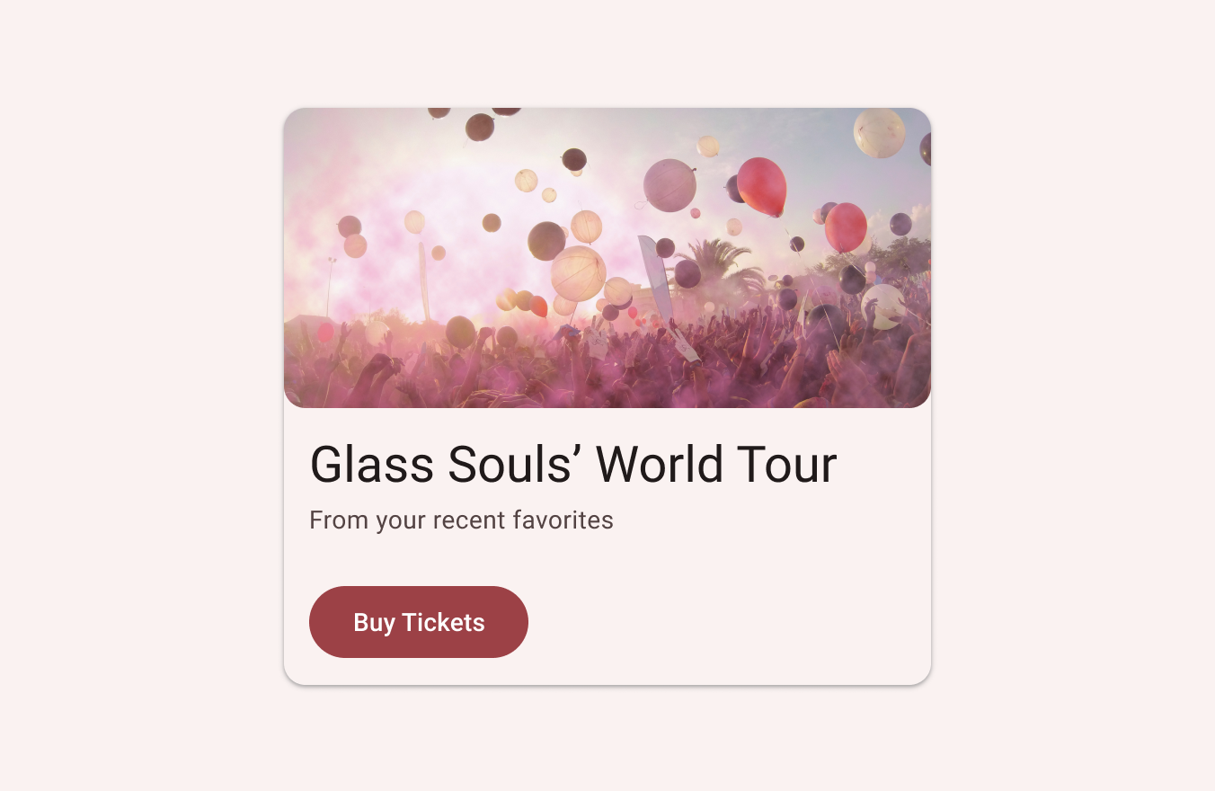
Card containing text and images Cards can display content and actions on a single topic.
There are four types of cards:
- Elevated card
- Filled card
- Outlined card
- Custom Card view
.png)
Takeaways
- A card is identifiable as a single, contained unit.
- A card can hold anything from images to headlines, supporting text, buttons, lists, and other components.
- A card’s layout and dimensions depend on its contents. There is no one right way to make a card.
What's new
- Color: New color mappings and compatibility with dynamic color
- Elevation: Lower elevation and no shadow by default
- Types: Three official card types – elevated, filled, and outlined
Eg:

Card Checkable Making a card checkable
When a card is checked, it will show a checked icon and change its foreground color. There is no default behavior for enabling/disabling the checked state. An example of how to do it in response to a single click / long click is shown below.
In the layout:
 <!--Making a card checkable-->
            <com.google.android.material.card.MaterialCardView
                android:id="@+id/cardClickable"
                android:layout_width="match_parent"
                android:layout_height="wrap_content"
                android:layout_margin="18dp"

                android:clickable="true"
                android:focusable="true"
                android:checkable="true"
                >

                <LinearLayout
                    android:layout_width="match_parent"
                    android:layout_height="wrap_content"
                    android:orientation="vertical">

                    <!-- Media -->
                    <!--<ImageView
                        android:layout_width="match_parent"
                        android:layout_height="194dp"
                        app:srcCompat="@drawable/ic_m4_blue_banner"
                        android:scaleType="centerCrop"
                        android:contentDescription="@string/content_description_media"
                        />
-->
                    <LinearLayout
                        android:layout_width="match_parent"
                        android:layout_height="wrap_content"
                        android:orientation="vertical"
                        android:padding="16dp">

                        <!-- Title, secondary and supporting text -->
                        <TextView
                            android:layout_width="wrap_content"
                            android:layout_height="wrap_content"
                            android:text="Card checkable"
                            android:textStyle="bold"
                            android:textAppearance="?attr/textAppearanceTitleMedium"
                            />
                        <TextView
                            android:layout_width="wrap_content"
                            android:layout_height="wrap_content"
                            android:layout_marginTop="8dp"
                            android:text="Making a card checkable."
                            android:textAppearance="?attr/textAppearanceBodyMedium"
                            android:textColor="?android:attr/textColorSecondary"
                            />
                        <TextView
                            android:layout_width="wrap_content"
                            android:layout_height="wrap_content"
                            android:layout_marginTop="16dp"
                            android:text="@string/supporting_text"
                            android:textAppearance="?attr/textAppearanceBodyMedium"
                            android:textColor="?android:attr/textColorSecondary"
                            />

                    </LinearLayout>

                    <!-- Buttons -->
                    <LinearLayout
                        android:layout_width="wrap_content"
                        android:layout_height="wrap_content"
                        android:layout_margin="8dp"
                        android:orientation="horizontal">
                        <com.google.android.material.button.MaterialButton
                            android:layout_width="wrap_content"
                            android:layout_height="wrap_content"
                            android:layout_marginEnd="8dp"
                            android:text="@string/action_1"
                            style="?attr/borderlessButtonStyle"
                            />
                        <com.google.android.material.button.MaterialButton
                            android:layout_width="wrap_content"
                            android:layout_height="wrap_content"
                            android:text="@string/action_2"
                            style="?attr/borderlessButtonStyle"
                            />
                    </LinearLayout>

                </LinearLayout>

            </com.google.android.material.card.MaterialCardView>
In the c:ode
binding.cardClickable.apply {

            //on long click
            setOnLongClickListener {
                isChecked = !this.isChecked
                true
            }
            // click
            setOnClickListener {
                isChecked = !this.isChecked
            }
        }
..
Outlined card
The following example shows an outlined card.
 <!--Card-->
            <com.google.android.material.card.MaterialCardView
                android:id="@+id/card"
                android:layout_width="match_parent"
                android:layout_height="wrap_content"
                android:layout_margin="18dp">

                <LinearLayout
                    android:layout_width="match_parent"
                    android:layout_height="wrap_content"
                    android:orientation="vertical">

                    <!-- Media -->
                    <ImageView
                        android:layout_width="match_parent"
                        android:layout_height="194dp"
                        app:srcCompat="@drawable/bg_4"
                        android:scaleType="centerCrop"
                        android:contentDescription="@string/content_description_media"
                        />

                    <LinearLayout
                        android:layout_width="match_parent"
                        android:layout_height="wrap_content"
                        android:orientation="vertical"
                        android:padding="16dp">

                        <!-- Title, secondary and supporting text -->
                        <TextView
                            android:layout_width="wrap_content"
                            android:layout_height="wrap_content"
                            android:text="Card"
                            android:textStyle="bold"
                            android:textAppearance="?attr/textAppearanceTitleMedium"
                            />
                        <TextView
                            android:layout_width="wrap_content"
                            android:layout_height="wrap_content"
                            android:layout_marginTop="8dp"
                            android:text="The following example shows an outlined card."
                            android:textAppearance="?attr/textAppearanceBodyMedium"
                            android:textColor="?android:attr/textColorSecondary"
                            />
                        <TextView
                            android:layout_width="wrap_content"
                            android:layout_height="wrap_content"
                            android:layout_marginTop="16dp"
                            android:text="@string/supporting_text"
                            android:textAppearance="?attr/textAppearanceBodyMedium"
                            android:textColor="?android:attr/textColorSecondary"
                            />

                    </LinearLayout>

                    <!-- Buttons -->
                    <LinearLayout
                        android:layout_width="wrap_content"
                        android:layout_height="wrap_content"
                        android:layout_margin="8dp"
                        android:orientation="horizontal">
                        <com.google.android.material.button.MaterialButton
                            android:layout_width="wrap_content"
                            android:layout_height="wrap_content"
                            android:layout_marginEnd="8dp"
                            android:text="@string/action_1"
                            style="?attr/borderlessButtonStyle"
                            />
                        <com.google.android.material.button.MaterialButton
                            android:layout_width="wrap_content"
                            android:layout_height="wrap_content"
                            android:text="@string/action_2"
                            style="?attr/borderlessButtonStyle"
                            />
                    </LinearLayout>

                </LinearLayout>

            </com.google.android.material.card.MaterialCardView>
..
Filled card
The following example shows a filled card.
  <!--Filled card-->
            <com.google.android.material.card.MaterialCardView
                style="?attr/materialCardViewFilledStyle"
                android:layout_width="match_parent"
                android:layout_height="wrap_content"
                android:layout_margin="18dp">

                <LinearLayout
                    android:layout_width="match_parent"
                    android:layout_height="wrap_content"
                    android:orientation="vertical">

                    <!-- Media -->
                    <ImageView
                        android:layout_width="match_parent"
                        android:layout_height="194dp"
                        app:srcCompat="@drawable/bg_4"
                        android:scaleType="centerCrop"
                        android:contentDescription="@string/content_description_media"
                        />

                    <LinearLayout
                        android:layout_width="match_parent"
                        android:layout_height="wrap_content"
                        android:orientation="vertical"
                        android:padding="16dp">

                        <!-- Title, secondary and supporting text -->
                        <TextView
                            android:layout_width="wrap_content"
                            android:layout_height="wrap_content"
                            android:text="Filled card"
                            android:textStyle="bold"
                            android:textAppearance="?attr/textAppearanceTitleMedium"
                            />
                        <TextView
                            android:layout_width="wrap_content"
                            android:layout_height="wrap_content"
                            android:layout_marginTop="8dp"
                            android:text="The following example shows an filled card."
                            android:textAppearance="?attr/textAppearanceBodyMedium"
                            android:textColor="?android:attr/textColorSecondary"
                            />
                        <TextView
                            android:layout_width="wrap_content"
                            android:layout_height="wrap_content"
                            android:layout_marginTop="16dp"
                            android:text="@string/supporting_text"
                            android:textAppearance="?attr/textAppearanceBodyMedium"
                            android:textColor="?android:attr/textColorSecondary"
                            />

                    </LinearLayout>

                    <!-- Buttons -->
                    <LinearLayout
                        android:layout_width="wrap_content"
                        android:layout_height="wrap_content"
                        android:layout_margin="8dp"
                        android:orientation="horizontal">
                        <com.google.android.material.button.MaterialButton
                            android:layout_width="wrap_content"
                            android:layout_height="wrap_content"
                            android:layout_marginEnd="8dp"
                            android:text="@string/action_1"
                            style="?attr/borderlessButtonStyle"
                            />
                        <com.google.android.material.button.MaterialButton
                            android:layout_width="wrap_content"
                            android:layout_height="wrap_content"
                            android:text="@string/action_2"
                            style="?attr/borderlessButtonStyle"
                            />
                    </LinearLayout>

                </LinearLayout>

            </com.google.android.material.card.MaterialCardView>
..
Elevated card
The following example shows an elevated card.
  <!--Elevated card-->
            <com.google.android.material.card.MaterialCardView
                style="?attr/materialCardViewElevatedStyle"
                android:layout_width="match_parent"
                android:layout_height="wrap_content"
                app:cardElevation="20dp"
                android:layout_margin="18dp">

                <LinearLayout
                    android:layout_width="match_parent"
                    android:layout_height="wrap_content"
                    android:orientation="vertical">

                    <!-- Media -->
                    <ImageView
                        android:layout_width="match_parent"
                        android:layout_height="194dp"
                        app:srcCompat="@drawable/bg_4"
                        android:scaleType="centerCrop"
                        android:contentDescription="@string/content_description_media"
                        />

                    <LinearLayout
                        android:layout_width="match_parent"
                        android:layout_height="wrap_content"
                        android:orientation="vertical"
                        android:padding="16dp">

                        <!-- Title, secondary and supporting text -->
                        <TextView
                            android:layout_width="wrap_content"
                            android:layout_height="wrap_content"
                            android:text="Elevated card"
                            android:textStyle="bold"
                            android:textAppearance="?attr/textAppearanceTitleMedium"
                            />
                        <TextView
                            android:layout_width="wrap_content"
                            android:layout_height="wrap_content"
                            android:layout_marginTop="8dp"
                            android:text="The following example shows an elevated card."
                            android:textAppearance="?attr/textAppearanceBodyMedium"
                            android:textColor="?android:attr/textColorSecondary"
                            />
                        <TextView
                            android:layout_width="wrap_content"
                            android:layout_height="wrap_content"
                            android:layout_marginTop="16dp"
                            android:text="@string/supporting_text"
                            android:textAppearance="?attr/textAppearanceBodyMedium"
                            android:textColor="?android:attr/textColorSecondary"
                            />

                    </LinearLayout>

                    <!-- Buttons -->
                    <LinearLayout
                        android:layout_width="wrap_content"
                        android:layout_height="wrap_content"
                        android:layout_margin="8dp"
                        android:orientation="horizontal">
                        <com.google.android.material.button.MaterialButton
                            android:layout_width="wrap_content"
                            android:layout_height="wrap_content"
                            android:layout_marginEnd="8dp"
                            android:text="@string/action_1"
                            style="?attr/borderlessButtonStyle"
                            />
                        <com.google.android.material.button.MaterialButton
                            android:layout_width="wrap_content"
                            android:layout_height="wrap_content"
                            android:text="@string/action_2"
                            style="?attr/borderlessButtonStyle"
                            />
                    </LinearLayout>

                </LinearLayout>

            </com.google.android.material.card.MaterialCardView>
..
Implementing card theming
Using theme attributes and a style in res/values/styles.xml (themes all cards and affects other components):
In the theme.xml
 <!--Theming cards-->
    <style name="Widget.App.CardView" parent="Widget.Material3.CardView.Outlined">
        <item name="materialThemeOverlay">@style/ThemeOverlay.App.Card</item>
        <item name="shapeAppearance">@style/ShapeAppearance.App.MediumComponent</item>
    </style>
    <style name="ThemeOverlay.App.Card" parent="">
        <item name="colorSecondary">#F2B8B5</item>
        <item name="colorSurface">#FAEFED</item>
        <item name="colorOnSurfaceVariant">#F2B8B5</item>
    </style>
    <style name="ShapeAppearance.App.MediumComponent" parent="ShapeAppearance.Material3.MediumComponent">
        <item name="cornerFamily">cut</item>
        <item name="cornerSize">8dp</item>
    </style>
In the layout
 <!--Theming cards-->
            <com.google.android.material.card.MaterialCardView
                style="@style/Widget.App.CardView"
                android:layout_width="match_parent"
                android:layout_height="wrap_content"
                android:layout_margin="18dp">

                <LinearLayout
                    android:layout_width="match_parent"
                    android:layout_height="wrap_content"
                    android:orientation="vertical">

                    <!-- Media -->
                    <ImageView
                        android:layout_width="match_parent"
                        android:layout_height="194dp"
                        app:srcCompat="@drawable/bg_4"
                        android:scaleType="centerCrop"
                        android:contentDescription="@string/content_description_media"
                        />

                    <LinearLayout
                        android:layout_width="match_parent"
                        android:layout_height="wrap_content"
                        android:orientation="vertical"
                        android:padding="16dp">

                        <!-- Title, secondary and supporting text -->
                        <TextView
                            android:layout_width="wrap_content"
                            android:layout_height="wrap_content"
                            android:text="Elevated card"
                            android:textStyle="bold"
                            android:textAppearance="?attr/textAppearanceTitleMedium"
                            />
                        <TextView
                            android:layout_width="wrap_content"
                            android:layout_height="wrap_content"
                            android:layout_marginTop="8dp"
                            android:text="The following example shows an elevated card."
                            android:textAppearance="?attr/textAppearanceBodyMedium"
                            android:textColor="?android:attr/textColorSecondary"
                            />
                        <TextView
                            android:layout_width="wrap_content"
                            android:layout_height="wrap_content"
                            android:layout_marginTop="16dp"
                            android:text="@string/supporting_text"
                            android:textAppearance="?attr/textAppearanceBodyMedium"
                            android:textColor="?android:attr/textColorSecondary"
                            />

                    </LinearLayout>

                    <!-- Buttons -->
                    <LinearLayout
                        android:layout_width="wrap_content"
                        android:layout_height="wrap_content"
                        android:layout_margin="8dp"
                        android:orientation="horizontal">
                        <com.google.android.material.button.MaterialButton
                            android:layout_width="wrap_content"
                            android:layout_height="wrap_content"
                            android:layout_marginEnd="8dp"
                            android:text="@string/action_1"
                            style="?attr/borderlessButtonStyle"
                            />
                        <com.google.android.material.button.MaterialButton
                            android:layout_width="wrap_content"
                            android:layout_height="wrap_content"
                            android:text="@string/action_2"
                            style="?attr/borderlessButtonStyle"
                            />
                    </LinearLayout>

                </LinearLayout>

            </com.google.android.material.card.MaterialCardView>
..
Shapeable Image View Card
In order to optimize shape theming, some (optional) adjustments need to be made to the card layout to incorporate ShapeableImageView.
In this theme.xml
 <!--ShapeableImageView Card-->
    <style name="ShapeAppearanceOverlay.App.Card.Media" parent="">
        <item name="cornerSizeBottomLeft">0dp</item>
        <item name="cornerSizeBottomRight">0dp</item>
    </style>
In this layout
 <!--ShapeableImageView cards-->
            <com.google.android.material.card.MaterialCardView
                android:layout_width="match_parent"
                android:layout_height="wrap_content"
                app:cardPreventCornerOverlap="false"
                android:layout_margin="18dp">

                <!-- Media -->
                <com.google.android.material.imageview.ShapeableImageView
                    android:layout_width="match_parent"

                    app:shapeAppearance="?attr/shapeAppearanceMediumComponent"
                    app:shapeAppearanceOverlay="@style/ShapeAppearanceOverlay.App.Card.Media"

                    android:layout_height="194dp"
                    app:srcCompat="@drawable/bg_4"
                    android:scaleType="centerCrop"
                    android:contentDescription="@string/content_description_media"
                    />

            </com.google.android.material.card.MaterialCardView>
..
Tags:
Android

Thank you