
To use the MaterialBanner class in Flutter to display important information and actions to users. The MaterialBanner is a widget provided by the Flutter Material library that displays a prominent message, along with optional actions, at the top of the screen.
Our guide covers everything from creating and customizing a MaterialBanner to handling user interactions with the banner.
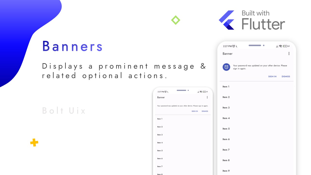
A banner displays an important, succinct message, and provides actions for users to address (or dismiss the banner). A user action is required for it to be dismissed.
MaterialBanner(
  leading: Icon(Icons.warning),
  content: Text('This is a warning message.'),
  actions: [
    TextButton(
      child: Text('DISMISS'),
      onPressed: () {
        // Handle dismiss action here
      },
    ),
    TextButton(
      child: Text('VIEW DETAILS'),
      onPressed: () {
        // Handle view details action here
      },
    ),
  ],
);
Step by Step Code Explanation:
Create a new MaterialBanner widget.
- Set the leading property to an Icon widget with the Icons.warning icon to display a warning icon at the left side of the banner.
- Set the content property to a Text widget with the message to display in the banner.
- Set the actions property to an array of two TextButton widgets with labels for the dismiss and view details actions, respectively.
- For each TextButton widget, set the onPressed property to a function that handles the corresponding action when the button is pressed.
..
Code snippet:
import 'package:flutter/material.dart';

// Enumeration to define banner demo actions
enum BannerDemoAction {
  reset,
  showMultipleActions,
  showLeading,
}

// A stateful widget that demonstrates the Material Banner widget
class BannerDemo extends StatefulWidget {
  const BannerDemo({super.key});

  @override
  State<BannerDemo> createState() => _BannerDemoState();
}

class _BannerDemoState extends State<BannerDemo> with RestorationMixin {
  // Number of items to be displayed in the list view
  static const _itemCount = 20;

  @override
  // Unique restoration ID for the banner demo
  String get restorationId => 'banner_demo';

  @override
  // Restore the state of the banner demo
  void restoreState(RestorationBucket? oldBucket, bool initialRestore) {
    registerForRestoration(_displayBanner, 'display_banner');
    registerForRestoration(_showMultipleActions, 'show_multiple_actions');
    registerForRestoration(_showLeading, 'show_leading');
  }

  // Restorable boolean values to control banner properties
  final RestorableBool _displayBanner = RestorableBool(true);
  final RestorableBool _showMultipleActions = RestorableBool(true);
  final RestorableBool _showLeading = RestorableBool(true);

  @override
  // Dispose the restorable boolean values
  void dispose() {
    _displayBanner.dispose();
    _showMultipleActions.dispose();
    _showLeading.dispose();
    super.dispose();
  }

  // Handle the banner demo actions
  void handleDemoAction(BannerDemoAction action) {
    setState(() {
      switch (action) {
      // Reset the banner properties to default
        case BannerDemoAction.reset:
          _displayBanner.value = true;
          _showMultipleActions.value = true;
          _showLeading.value = true;
          break;
      // Toggle the display of multiple actions
        case BannerDemoAction.showMultipleActions:
          _showMultipleActions.value = !_showMultipleActions.value;
          break;
      // Toggle the display of leading icon
        case BannerDemoAction.showLeading:
          _showLeading.value = !_showLeading.value;
          break;
      }
    });
  }

  @override
  // Build the UI for the banner demo
  Widget build(BuildContext context) {
    final colorScheme = Theme.of(context).colorScheme;

    // Define the banner widget
    final banner = MaterialBanner(
      content: const Text('Your password was updated on your other device. Please sign in again.'),
      leading: _showLeading.value
          ? CircleAvatar(
        backgroundColor: colorScheme.primary,
        child: Icon(Icons.access_alarm, color: colorScheme.onPrimary),
      )
          : null,
      actions: [
        // Sign in button
        TextButton(
          onPressed: () {
            setState(() {
              _displayBanner.value = false;
            });
          },
          child: const Text('SIGN IN'),
        ),
        // Dismiss button (if multiple actions is enabled)
        if (_showMultipleActions.value)
          TextButton(
            onPressed: () {
              setState(() {
                _displayBanner.value = false;
              });
            },
            child: const Text('DISMISS'),
          ),
      ],
      backgroundColor: colorScheme.background,
    );

    // Build the scaffold widget with an app bar and a list view
    return Scaffold(
      appBar: AppBar(
        automaticallyImplyLeading: false,
        title: const Text('Banner'),
        actions: [
          // Popup menu button to show banner demo actions
          PopupMenuButton<BannerDemoAction>(
            onSelected: handleDemoAction,
            itemBuilder: (context) => <PopupMenuEntry<BannerDemoAction>>[
              const PopupMenuItem<BannerDemoAction>(
                value: BannerDemoAction.reset,
                child: Text('Reset the banner'),
              ),
              const PopupMenuDivider(),
              CheckedPopupMenuItem<BannerDemoAction>(
                value: BannerDemoAction.showMultipleActions,
                checked: _showMultipleActions.value,
                child: const Text('Multiple actions'),
              ),
              CheckedPopupMenuItem<BannerDemoAction>(
                value: BannerDemoAction.showLeading,
                checked: _showLeading.value,
                child: const Text('Leading Icon'),
              ),
            ],
          ),
        ],
      ),

      // List of item
      body: ListView.builder(
        restorationId: 'banner_demo_list_view',
        itemCount: _displayBanner.value ? _itemCount + 1 : _itemCount,
        itemBuilder: (context, index) {
          if (index == 0 && _displayBanner.value) {
            return banner;
          }
          return ListTile(
            title: Text(
              'Item ${_displayBanner.value ? index : index + 1}',
            ),
          );
        },
      ),
    );
  }
}
..
The MaterialBanner widget displays a prominent message and related actions in a material design widget.
- The BannerDemoAction enumeration defines three actions for the demo: reset, showMultipleActions, and showLeading.
- The BannerDemo class is a stateful widget that represents the demo itself.
- The RestorationMixin is a mixin that provides state restoration capabilities to the widget.
- The RestorableBool class is used to define three boolean values that are restorable: _displayBanner, _showMultipleActions, and _showLeading.
- The handleDemoAction method updates the state of the widget based on the action that was triggered.
- The build method creates the MaterialBanner widget and a ListView widget that displays a list of items with an optional banner.
- The AppBar widget displays the app bar with a title and a popup menu button that triggers one of the three actions defined in the BannerDemoAction enumeration.
.


.
..
Tags:
flutter
