In this post, we'll explore how to create a Material Design alert dialog in Flutter, and how to customize its appearance to match your app's design.
With the help of code snippets and detailed explanations, you'll learn how to use the built-in AlertDialog widget and its various properties to create user-friendly and engaging dialogs.

An AlertDialog widget displays a popup on top of the content.
You can use it to notify user about an information or warning and allow the user to take an action. You can also use it to get input from user, like letting user choose from options, or providing text input.
Info Dialog:
Following is a basic AlertDialog widget.
  void openDialog(BuildContext context) {
    final textTheme = Theme.of(context)
        .textTheme
        .apply(displayColor: Theme.of(context).colorScheme.onSurface);

    showDialog<void>(
      context: context,
      builder: (context) => AlertDialog(
        title: TextStyleExample(name : 'Basic Dialog Title',style : textTheme.titleLarge!),
        content: TextStyleExample(name : "A dialog is a type of modal window that appears in front of app content to provide critical information, or prompt for a decision to be made." ,style : textTheme.titleSmall!),
        actions: <Widget>[
          TextButton(
            //child: const Text('OK'),
            child: TextStyleExample(name : 'OK',style : textTheme.labelLarge!),
            onPressed: () => Navigator.of(context).pop(),
          ),
        ],
      ),
    );
  }
The AlertDialog has three properties:

title: This is the title of the dialog, and it uses a TextStyleExample widget with a text passed as "Basic Dialog Title" and the style defined by textTheme.titleLarge
content: This is the content of the dialog, and it uses a TextStyleExample widget with a text passed as a description of what a dialog is and the style defined by textTheme.titleSmall
actions: This is a list of actions that are displayed at the bottom of the dialog. In this case, there is only one action, a TextButton with the text "OK" and the style defined by textTheme.labelLarge. When this button is pressed, it calls the Navigator.of(context).pop() method to close the dialog.
..
Confirmation Dialog:
This code defines a method called confirmationDialog that displays a Material Design alert dialog in a Flutter application. The dialog has two buttons: "DISAGREE" and "AGREE". When the "DISAGREE" button is pressed, the dialog will be dismissed and no action will be taken. On the other hand, when the "AGREE" button is pressed, the dialog will also be dismissed.
The showDialog method is used to display the dialog, which takes in a context parameter that refers to the BuildContext of the current widget, and a builder parameter that returns the widget tree for the dialog. The barrierDismissible parameter is set to false to prevent the dialog from being dismissed by tapping outside the dialog.
The text themes are defined using the apply method of the textTheme object. The display color of the text theme is set to the onSurface color of the current theme using the colorScheme property of the context. The TextStyleExample widget is used to apply the text theme to the dialog's title and content.

  void confirmationDialog(BuildContext context) async {

    final textTheme = Theme.of(context)
        .textTheme
        .apply(displayColor: Theme.of(context).colorScheme.onSurface);

    showDialog(
      context: context,
      barrierDismissible: false,
      builder: (BuildContext context) {
        return AlertDialog(
         // title: TextStyleExample(name : 'Privacy',style : textTheme.titleMedium!.copyWith(color: MyColors.black, fontWeight: FontWeight.bold)),
          title: TextStyleExample(name : 'Customer Agreement ',style : textTheme.titleLarge!),
          content: TextStyleExample(name : "By clicking 'AGREE', you agree to the Terms of Use and Privacy Policy" ,style : textTheme.titleSmall!),
          actions: <Widget>[
            TextButton(
              child: TextStyleExample(name : 'DISAGREE',style : textTheme.labelLarge!),
              //child: TextStyleExample(name : 'DISAGREE',style : textTheme.labelLarge!),
              onPressed: () {
                Navigator.of(context).pop();
              },
            ),
            TextButton(
             // child: TextStyleExample(name : 'AGREE',style : textTheme.labelLarge!.copyWith(color: MyColors.accentDark)),
              child: TextStyleExample(name : 'AGREE',style : textTheme.labelLarge!),
              onPressed: () {
                Navigator.of(context).pop();
              },
            )
          ],
        );
      },
    );
  }
..
Single Choice Dialog:
The given code defines two classes, SingleChoiceDialog and SingleChoiceDialogState.
SingleChoiceDialog is a stateful widget that creates an instance of SingleChoiceDialogState.
SingleChoiceDialogState extends the State class and it's responsible for building the UI of the single choice dialog.
The class maintains a state variable selectedRingtone which holds the current selected ringtone. Another list ringtone holds the available options to choose from.
The build method of the SingleChoiceDialogState class returns a SimpleDialog widget. The dialog has a title which is a TextStyleExample widget and a list of options represented by RadioListTile widgets. The RadioListTile widgets are created by mapping the elements in the ringtone list and creating a RadioListTile for each of the elements.
The RadioListTile widget is used to display a single choice item in a list, it has a title property which is a TextStyleExample widget that displays the ringtone name. The groupValue property is set to the current selected ringtone and the selected property indicates whether this ringtone is currently selected or not. The onChanged property is a callback that is called when the radio button is selected, it sets the selectedRingtone to the selected ringtone.
This code will create a single choice dialog that allows the user to choose a ringtone from the available options. The current selected ringtone will be displayed in the dialog.
   ..onTap: () {
                  showDialog(context: context,builder: (_) => const SingleChoiceDialog() );
                },
This code shows a dialog when a widget is tapped. The dialog to be displayed is the SingleChoiceDialog widget, which is passed as a constant to the showDialog method.
The showDialog method takes the context and the builder parameter, which returns the SingleChoiceDialog widget.
The context parameter provides the context of the widget that was tapped, and the builder parameter is a function that returns the widget to be displayed in the dialog.
...
class SingleChoiceDialog extends StatefulWidget {

  const SingleChoiceDialog({Key? key}) : super(key: key);

  @override
  SingleChoiceDialogState createState() => SingleChoiceDialogState();
}
class SingleChoiceDialogState extends State<SingleChoiceDialog>{

  String? selectedRingtone = "None";
  List<String> ringtone = [
    "None", "Classic rock", "Monophonic", "Luna"
  ];

  @override
  Widget build(BuildContext context){
    final textTheme = Theme.of(context)
        .textTheme
        .apply(displayColor: Theme.of(context).colorScheme.onSurface);

    return SimpleDialog(
      //title: TextStyleExample(name : 'Phone Ringtone',style : textTheme.titleMedium!.copyWith(color: MyColors.black, fontWeight: FontWeight.bold)),
      title: TextStyleExample(name : 'Phone Ringtone',style : textTheme.titleMedium!),
      children: ringtone.map((r) => RadioListTile(
        title:  TextStyleExample(name : r ,style : textTheme.titleSmall!),
        groupValue: selectedRingtone,
        selected: r == selectedRingtone,
        value: r,
        onChanged: (dynamic val) {
          setState(() {
            selectedRingtone = val;
              // Navigator.of(context).pop();
          });
        },
      )).toList(),
    );
  }
}

..
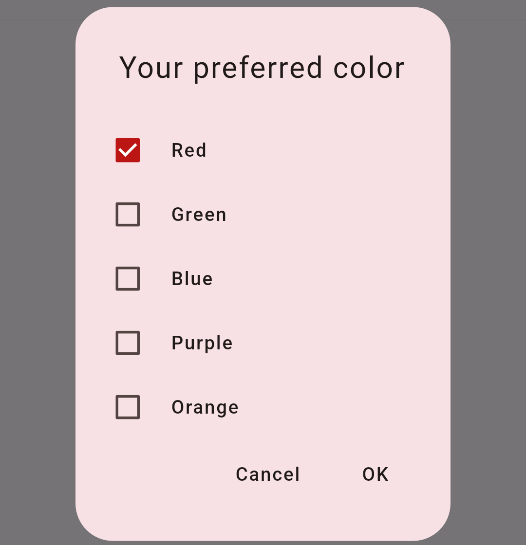
Multiple choice dialog:
This is a Flutter code for a multi-choice dialog widget. The widget extends from StatefulWidget and implements MultiChoiceDialogState class to define the state of the dialog.
MultiChoiceDialog has a member variable colors which is a list of strings representing the color options to be displayed in the dialog. Another member variable status is a list of booleans indicating the selected status of each color option.
The build method of the MultiChoiceDialogState class creates the dialog's visual structure and appearance. It sets the title of the dialog to "Your preferred color". The content of the dialog is a wrap widget containing an inkwell widget for each color option. The inkwell widget consists of a row widget with a checkbox and the color name.
The getValue method retrieves the status of a color option. The toggleValue method changes the status of a color option. The onPressed event of the "OK" button closes the dialog. The onPressed event of the "Cancel" button also closes the dialog.
The dialog can be shown by calling showDialog and passing in the context and the MultiChoiceDialog widget as the builder argument.
class MultiChoiceDialog extends StatefulWidget {

  const MultiChoiceDialog({Key? key}) : super(key: key);

  @override
  MultiChoiceDialogState createState() => MultiChoiceDialogState();
}
class MultiChoiceDialogState extends State<MultiChoiceDialog>{

  List<String> colors = [
    "Red", "Green", "Blue", "Purple", "Orange"
  ];

  List<bool> status = [
    true, false, false, false, false, false
  ];

  bool getValue(String val){
    int index = colors.indexOf(val);
    if(index == -1) return false;
    return status[index];
  }

  void toggleValue(String name){
    int index = colors.indexOf(name);
    if(index == -1) return;
    status[index] = !status[index];
  }

  @override
  Widget build(BuildContext context){

    final textTheme = Theme.of(context)
        .textTheme
        .apply(displayColor: Theme.of(context).colorScheme.onSurface);

    return AlertDialog(
      title: TextStyleExample(name : 'Your preferred color',style : textTheme.titleLarge!),
      contentPadding: const EdgeInsets.fromLTRB(15, 15, 15, 0),
      content: Wrap(
        direction: Axis.vertical,
        children: colors.map((c) => InkWell(
          child: Row(
            children: <Widget>[
              Checkbox(value: getValue(c), onChanged: (value) {
          setState(() {
            toggleValue(c);
          });
        }),
              TextStyleExample(name : c,style : textTheme.titleSmall!,),
            ],
          ),
          onTap: (){
            setState(() {
              toggleValue(c);
            });
          },
        )).toList(),
      ),
      actions: <Widget>[
        TextButton(
          child:TextStyleExample(name : 'Cancel',style : textTheme.labelLarge!),
          onPressed: () {
            Navigator.of(context).pop();
          },
        ),
        TextButton(
          //child:  TextStyleExample(name : 'OK',style : textTheme.labelLarge!.copyWith(color: MyColors.accentDark)),
          child:  TextStyleExample(name : 'OK',style : textTheme.labelLarge!),
          onPressed: () {
            Navigator.of(context).pop();
          },
        )
      ],
    );
  }
}
..
..
GET source code on Github: