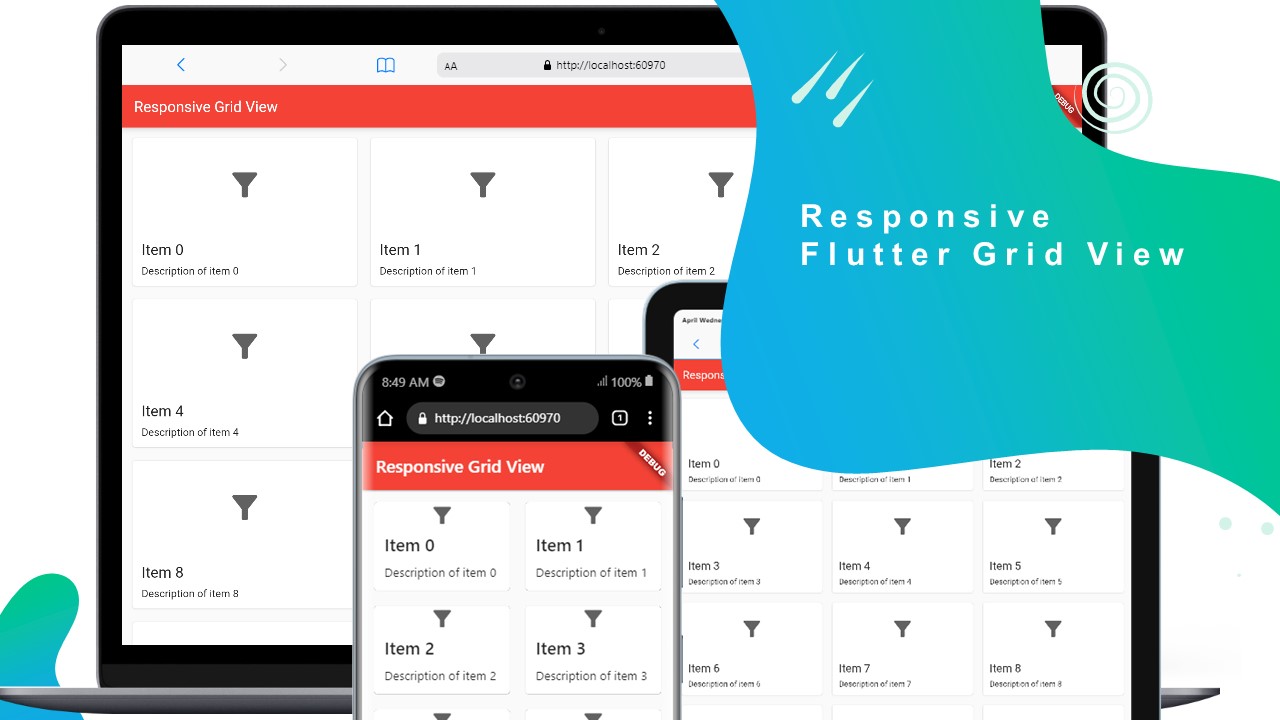
This code demonstrates how to create a responsive grid view in Flutter, where the number of columns and the size of the icons adapt based on the screen size of the device. The grid view displays a set of cards with an icon, title, and description for each item.
A Flutter code example demonstrating how to create a responsive grid view with variable number of columns and adaptive icon size based on the screen size.
Usage:
This code can be used as a starting point for creating a responsive grid view in a Flutter application. It provides a template that can be customized to suit the specific requirements of the application. The grid view is responsive and adapts to different screen sizes, making it suitable for various devices including mobile phones, tablets, and desktops.
Code:
import 'package:flutter/material.dart';
import '../util/responsive_utils.dart';
import '../util/typography.dart';

class MyResponsiveGrid extends StatelessWidget {
  const MyResponsiveGrid({Key? key}) : super(key: key);

  @override
  Widget build(BuildContext context) {

    final textTheme = Theme.of(context)
        .textTheme
        .apply(displayColor: Theme.of(context).colorScheme.onSurface);

    // Set the default number of columns to 3.
    int columnsCount = 3;

    // Define the icon size based on the screen width
    double iconSize =  45;

    // Use the ResponsiveUtils class to determine the device's screen size.
    if (ResponsiveUtils.isMobile(context)) {
      columnsCount = 2;
      iconSize = 30;
    } else if (ResponsiveUtils.isDesktop(context)) {
      columnsCount = 4;
      iconSize = 50;
    }

    // Build the grid view using the number of columns.
    return Scaffold(
      appBar: AppBar(
        title: const Text('Responsive Grid View'),
      ),
      body: GridView.builder(
        // Set padding and spacing between cards.
        padding: const EdgeInsets.all(10),
        gridDelegate: SliverGridDelegateWithFixedCrossAxisCount(
          // Set the number of columns based on the device's screen size.
          crossAxisCount: columnsCount,
          // Set the aspect ratio of each card.
          childAspectRatio: 3 / 2,
          crossAxisSpacing: 10,
          mainAxisSpacing: 10,
        ),
        // Set the number of items in the grid view.
        itemCount: 20,
        itemBuilder: (BuildContext context, int index) {
          // Build each card in the grid view.
          return Card(
            child: Column(
              crossAxisAlignment: CrossAxisAlignment.stretch,
              children: [
                Expanded(
                  // Add an image to each card.
                  child:
                      // Add an image to each card.
                      SizedBox(
                        height: 250,
                        child: Icon(
                          Icons.filter_list_alt,
                          size: iconSize,
                          color: Colors.grey[700],
                        ),
                      ),
                ),
                const SizedBox(height: 10),
                Padding(
                  padding: const EdgeInsets.symmetric(horizontal: 10),
                  child: Column(
                    crossAxisAlignment: CrossAxisAlignment.start,
                    children: [
                      // Add a title to each card.
                      MyTextStyle(
                          name: 'Item $index', style: textTheme.titleLarge!),
                      const SizedBox(height: 5),
                      // Add a description to each card.
                      MyTextStyle(
                          name: 'Description of item $index', style: textTheme.bodyMedium!),
                    ],
                  ),
                ),
                const SizedBox(height: 10),
              ],
            ),
          );
        },
        // Set the grid view to shrink wrap its contents.
        shrinkWrap: true,
        // Disable scrolling in the grid view.
        physics: const NeverScrollableScrollPhysics(),
      ),
    );
  }
}
..
lib : Util : typography.dart
import 'package:flutter/material.dart';

// create typography.dart file
class MyTextStyle extends StatelessWidget {
  const MyTextStyle({
    super.key,
    required this.name,
    required this.style,
  });

  final String name;
  final TextStyle style;

  @override
  Widget build(BuildContext context) {
    return Padding(
      padding: const EdgeInsets.all(2.0),
      child: Text(name, style: style),//.copyWith(letterSpacing: 1.0)
    );
  }
}
..
lib : Util : responsive_utils.dart
import 'package:flutter/material.dart';

class ResponsiveUtils {
  // Check if the device is considered as mobile based on screen width.
  static bool isMobile(BuildContext context) =>
      MediaQuery.of(context).size.width <= 600;

  // Check if the device is considered as tablet based on screen width.
  static bool isTablet(BuildContext context) =>
      MediaQuery.of(context).size.width > 600 &&
          MediaQuery.of(context).size.width <= 1200;

  // Check if the device is considered as desktop based on screen width.
  static bool isDesktop(BuildContext context) =>
      MediaQuery.of(context).size.width > 1200;
}
..
Properties:
- columnsCount: An integer that determines the number of columns in the grid view. It is set based on the screen size using the ResponsiveUtils class.
- iconSize: A double that specifies the size of the icon in the grid view. It is also set based on the screen size using the ResponsiveUtils class.
- padding: An EdgeInsets object that defines the padding around the entire grid view.
- gridDelegate: A SliverGridDelegate object that defines the layout of the grid view, including the number of columns, aspect ratio of each card, and spacing between cards.
- itemCount: An integer that specifies the total number of items in the grid view.
- itemBuilder: A callback function that builds each card in the grid view. It takes a BuildContext and an index as arguments and returns a widget.
- shrinkWrap: A boolean value that determines if the grid view should shrink wrap its contents or not.
- physics: A ScrollPhysics object that defines the scrolling behavior of the grid view. In this code, it is set to NeverScrollableScrollPhysics() to disable scrolling.