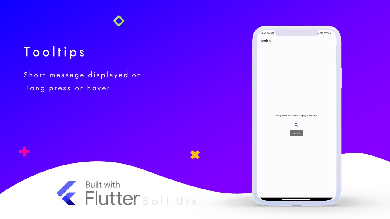
This tutorial provides a comprehensive guide to using the Tooltip widget in Flutter. You will learn how to add additional information to your UI elements, such as icons and buttons, by displaying a tooltip when the user interacts with them.
The tutorial includes a detailed code example with comments, step-by-step explanations, and a list of relevant hashtags to help you further explore this topic.
Tooltips provide text labels that help explain the function of a button or other user interface action. Tooltips display informative text when users hover over, focus on, or long press an element.
Code:
import 'package:flutter/material.dart';

class TooltipDemo extends StatelessWidget {
  const TooltipDemo({super.key});

  @override
  Widget build(BuildContext context) {
    return Scaffold(
      appBar: AppBar(
        automaticallyImplyLeading: false,
        title: const Text('Tooltip'),
      ),
      body: Center(
        child: Padding(
          padding: const EdgeInsets.all(8),
          child: Column(
            mainAxisAlignment: MainAxisAlignment.center,
            children: [
              const Text(
                'Long press or hover to display the tooltip',
                textAlign: TextAlign.center,
              ),
              const SizedBox(height: 16),
              // Add a tooltip to the IconButton
              Tooltip(
                message:  'Search', // The text to display in the tooltip
                child: IconButton(
                  color: Theme.of(context).colorScheme.primary,
                  onPressed: () {},
                  icon: const Icon(Icons.search),
                ),
              ),
            ],
          ),
        ),
      ),
    );
  }
}
Step by Step Code Explanation:
- Import the necessary package and dependencies.
- Create a stateless widget class called TooltipDemo.
- In the build method, create a Scaffold widget with an AppBar widget and a body.
- In the body, create a Center widget with a Padding widget and a Column widget.
- Add a Text widget to the Column.
- Add a SizedBox widget to the Column to create some space.
- Add a Tooltip widget to the Column as a child of an IconButton widget.
- In the Tooltip, specify the text to display using the message property.
- Customize the IconButton with a color and an onPressed function.
- Close all the open widgets by adding closing parentheses and semicolons where necessary.
..
Tags:
flutter

