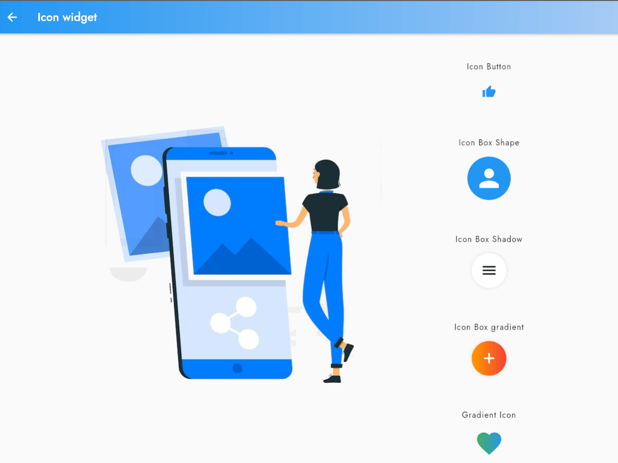
Icons are a key component of any mobile application, providing visual cues to users and helping them navigate the app.
In this blog post, you'll learn how to add icons to your Flutter application using the Icon Widget. We'll cover how to use both Material Icons and Cupertino Icons, as well as different ways to customize the appearance of your icons.
With these skills, you'll be able to create a more intuitive and engaging user experience in your Flutter apps
Material Icon:
Demonstrates the usage of the Icon widget with a Material Design icon from the Icons class.

..
Cupertino Icon:
Demonstrates the usage of the Icon widget with an iOS-style icon from the CupertinoIcons class.
// Cupertino Icon
                  const Icon(
                    CupertinoIcons.heart_solid,
                    color: Colors.blue,
                    size: 50,
                  ),

..
Icon Size:
Demonstrates how to set the size of an Icon widget using the size property.
const Icon(
                    Icons.thumb_up,
                    color: Colors.blue,
                    size: 100,
                  ),

..
Icon Button:
Demonstrates how to use the Icon widget within an IconButton widget to create an interactive icon that responds to user input.
IconButton(
                    icon: const Icon(
                      Icons.thumb_up,
                      color: Colors.blue,
                      //size: 50,
                    ),
                    onPressed: () => {},
                  ),

..
Icon Box Shape:
This demo showcases how to create a circular icon by setting the shape of the container to circle and giving it a blue background color.
The icon is then placed inside the container with a white color scheme and a size of 50. This is a useful technique to create rounded or circular icons for your app.
Container(
                    width: 75,
                    height: 75,
                    decoration: const BoxDecoration(
                      shape: BoxShape.circle,
                      color: Colors.blue,
                    ),
                    child:
                        const Icon(Icons.person, size: 50, color: Colors.white),
                  ),

..
Icon Box Shadow:
In this demo, a shadow effect is added to the container that houses the icon. This is achieved by setting the boxShadow property of the container to a BoxShadow widget with a blurRadius of 5 and a black12 color scheme.
The icon itself is given a black color scheme and a size of 30. This is a great way to add depth and dimension to your icons.
Container(
                    decoration: BoxDecoration(
                      color: Colors.white,
                      borderRadius: BorderRadius.circular(50),
                      boxShadow: const [
                        BoxShadow(
                          color: Colors.black12,
                          blurRadius: 5,
                        ),
                      ],
                    ),
                    padding: const EdgeInsets.all(15),
                    child: const Icon(
                      Icons.menu,
                      size: 30,
                      color: Colors.black,
                    ),
                  ),

..
Icon Box Gradient:
This demo showcases how to add a gradient effect to the container that houses the icon. The container has a circular border with a radius of 50 and a gradient color scheme that fades from orange to red.
The boxShadow property of the container is set to a BoxShadow widget with a blurRadius of 5 and a black12 color scheme. The icon itself is given a white color scheme and a size of 30.
This technique is useful to create icons with a more dynamic and eye-catching appearance.
Container(
                    decoration: BoxDecoration(
                      borderRadius: BorderRadius.circular(50),
                      gradient: const LinearGradient(
                        colors: [Colors.orange, Colors.red],
                      ),
                      boxShadow: const [
                        BoxShadow(
                          color: Colors.black12,
                          blurRadius: 5,
                        ),
                      ],
                    ),
                    padding: const EdgeInsets.all(15),
                    child: const Icon(
                      Icons.add,
                      size: 30,
                      color: Colors.white,
                    ),
                  ),

..
Gradient Icon:
This demo showcases how to add a gradient effect to an icon. The ShaderMask widget is used to apply a LinearGradient shader to the icon.
The LinearGradient widget is created with two colors (green and blue) and two stops (0.0 and 1.0). The icon itself is given a white color scheme and a size of 50.
This technique can be used to create icons with a more unique and personalized appearance.
ShaderMask(
                    shaderCallback: (Rect bounds) {
                      return const LinearGradient(
                        colors: [
                          Colors.green,
                          Colors.blue,
                        ],
                        stops: [
                          0.0,
                          1.0,
                        ],
                      ).createShader(bounds);
                    },
                    child: const Icon(
                      Icons.favorite,
                      size: 50,
                      color: Colors.white,
                    ),
                  ),

..
