How to Use Divider Components in Jetpack Compose (With Usage Examples)
Overview
Dividers in Jetpack Compose are thin lines that separate items in lists or containers, enhancing visual organization. The HorizontalDivider separates items in a Column, while the VerticalDivider separates items in a Row.
This guide demonstrates how to implement HorizontalDivider and VerticalDivider with customization options and best practices.
When to Use Dividers
| Divider Type | When to Use |
|---|---|
| Horizontal Divider | Separate items in a vertical list, such as menu options or settings sections. |
| Vertical Divider | Separate items in a horizontal layout, like side-by-side content or form fields. |
| Custom Styled Divider | Enhance visual hierarchy in branded UIs or complex layouts with custom thickness or colors. |
Creating Divider Components in Jetpack Compose
Horizontal Divider Example
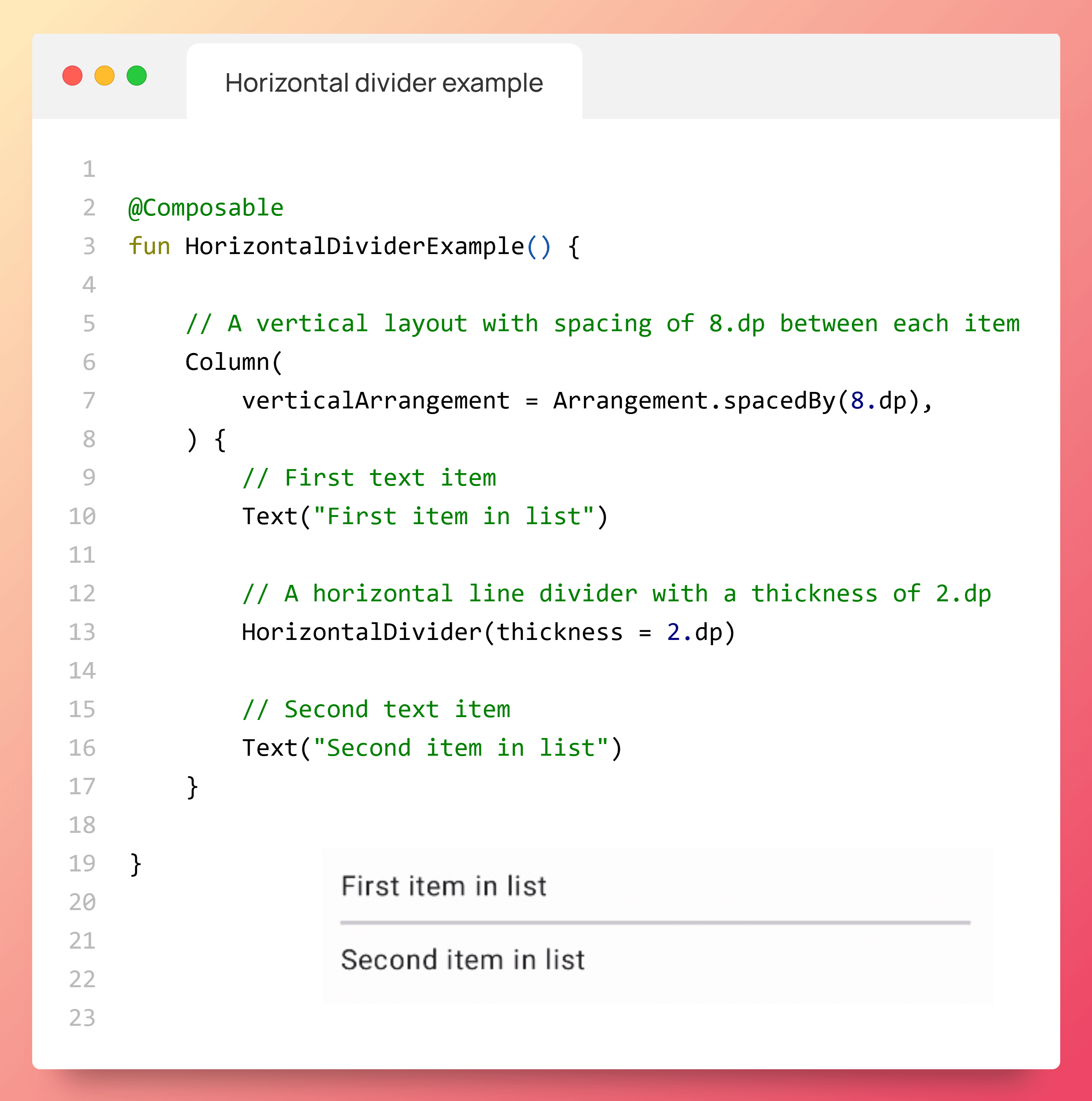
Creates a horizontal divider to separate items in a vertical list, such as menu options.
import androidx.compose.foundation.layout.Arrangement
import androidx.compose.foundation.layout.Column
import androidx.compose.material3.HorizontalDivider
import androidx.compose.material3.Text
import androidx.compose.runtime.Composable
import androidx.compose.ui.unit.dp

@Composable
fun HorizontalDividerExample() {
    Column(
        verticalArrangement = Arrangement.spacedBy(8.dp)
    ) {
        Text("First item in list")
        HorizontalDivider(thickness = 2.dp)
        Text("Second item in list")
    }
}
Result: A horizontal line with 2dp thickness separates two text items in a vertical layout.
Scenario: Use to visually distinguish items in a vertical list, such as separating menu items or settings categories.
Figure 1. A horizontal divider separating two text components.
Horizontal Divider Properties
| Property | Description |
|---|---|
| thickness | Sets the thickness of the divider line (e.g., 2.dp). |
Vertical Divider Example
Creates a vertical divider to separate items in a horizontal layout, such as form fields.
import androidx.compose.foundation.layout.Arrangement
import androidx.compose.foundation.layout.Row
import androidx.compose.foundation.layout.fillMaxWidth
import androidx.compose.foundation.layout.height
import androidx.compose.foundation.layout.IntrinsicSize
import androidx.compose.material3.VerticalDivider
import androidx.compose.material3.MaterialTheme
import androidx.compose.material3.Text
import androidx.compose.runtime.Composable

@Composable
fun VerticalDividerExample() {
    Row(
        modifier = Modifier
            .fillMaxWidth()
            .height(IntrinsicSize.Min),
        horizontalArrangement = Arrangement.SpaceEvenly
    ) {
        Text("First item in row")
        VerticalDivider(color = MaterialTheme.colorScheme.secondary)
        Text("Second item in row")
    }
}
Result: A vertical line with a secondary color separates two text items in a horizontal layout.
Scenario: Use to separate side-by-side content, such as form fields or dashboard metrics, in a row.
Figure 2. A vertical divider separating two text components.
Vertical Divider Properties
| Property | Description |
|---|---|
| color | Sets the color of the divider line (e.g., MaterialTheme.colorScheme.secondary). |
Custom Styled Divider Example
Creates a custom-styled horizontal divider with specific thickness and color for branded layouts.
import androidx.compose.foundation.layout.Arrangement
import androidx.compose.foundation.layout.Column
import androidx.compose.foundation.layout.padding
import androidx.compose.material3.HorizontalDivider
import androidx.compose.material3.Text
import androidx.compose.runtime.Composable
import androidx.compose.ui.Modifier
import androidx.compose.ui.graphics.Color
import androidx.compose.ui.unit.dp

@Composable
fun CustomStyledDividerExample() {
    Column(
        verticalArrangement = Arrangement.spacedBy(12.dp),
        modifier = Modifier.padding(horizontal = 16.dp)
    ) {
        Text("Profile Section")
        HorizontalDivider(
            thickness = 4.dp,
            color = Color(0xFF1767d0)
        )
        Text("Settings Section")
    }
}
Result: A thick, blue horizontal divider separates two section titles in a vertical layout.
Scenario: Use in branded UIs or complex layouts to visually distinguish major sections, such as profile and settings in a user interface.
Custom Styled Divider Properties
| Property | Description |
|---|---|
| thickness | Sets the thickness of the divider line (e.g., 4.dp). |
| color | Sets the color of the divider line (e.g., Color(0xFF1767d0)). |
| modifier | Applies modifications like padding (e.g., padding(horizontal = 16.dp)). |
Key Points for Implementation
- HorizontalDivider: Separates items in a
Columnlayout. - VerticalDivider: Separates items in a
Rowlayout. - thickness: Defines the divider line thickness (e.g.,
2.dp). - color: Sets the divider color (e.g.,
MaterialTheme.colorScheme.secondary). - modifier: Controls padding or other layout adjustments (e.g.,
padding(horizontal = 16.dp)). - Accessibility: Ensure dividers are not interactive and rely on surrounding content for context in screen readers.
Theming Dividers
Customize Divider appearance using MaterialTheme in Compose to define colors or apply specific styles via the color parameter.
import androidx.compose.foundation.layout.Arrangement
import androidx.compose.foundation.layout.Column
import androidx.compose.material3.MaterialTheme
import androidx.compose.material3.HorizontalDivider
import androidx.compose.material3.Text
import androidx.compose.runtime.Composable
import androidx.compose.ui.graphics.Color
import androidx.compose.ui.unit.dp

@Composable
fun ThemedDividerExample() {
    MaterialTheme(
        colorScheme = MaterialTheme.colorScheme.copy(
            primary = Color(0xFF1767d0)
        )
    ) {
        Column(
            verticalArrangement = Arrangement.spacedBy(8.dp)
        ) {
            Text("First item in list")
            HorizontalDivider(
                thickness = 2.dp,
                color = MaterialTheme.colorScheme.primary
            )
            Text("Second item in list")
        }
    }
}
Additional Resources
FAQ
What is a Divider component?
A thin line that separates items in lists or containers, enhancing visual organization.
Which composables are used for Dividers?
Use HorizontalDivider for vertical layouts and VerticalDivider for horizontal layouts.
How to make Dividers accessible?
Ensure dividers are non-interactive and rely on surrounding content for screen reader context.
Can I customize Divider appearance?
Yes, via thickness, color, or modifier parameters, and MaterialTheme.colorScheme.
%20%5B2025%5D.png)
.png)
.png)
%20%5B2025%5D.png)